Pride parades are wonderful things. They represent visibility, celebration, and solidarity for a community of people who are more than five times more likely to attempt suicide as children than their heterosexual counterparts. For many, Pride represents an infrequent opportunity to be loud, proud, and out. In 2019, about five million people visited New York City for its annual Pride march, making it one of the largest celebrations of queerness in the world.
Contrast this to the 5,000 attendees of the first Pride march, officially called the Christopher Street Liberation March, 49 years earlier in the exact same place. An act of protest, queer he's, she's, and they's took to the street for not dissimilar reasons of contemporary Pride marches: visibility. Protesters declared "you will witness us, you will treat us as human beings, you will respect us."
That's about where the similarities of Pride 1 and Pride 49 end. What once was a "desperate act of courage" has rapidly shifted towards a holiday. Between these two points in time sits a deadly AIDS epidemic, remarkable and devoted civil rights work and the 2015 legalization of gay marriage. Because of that, many have declared the battle for queer liberation officially won.
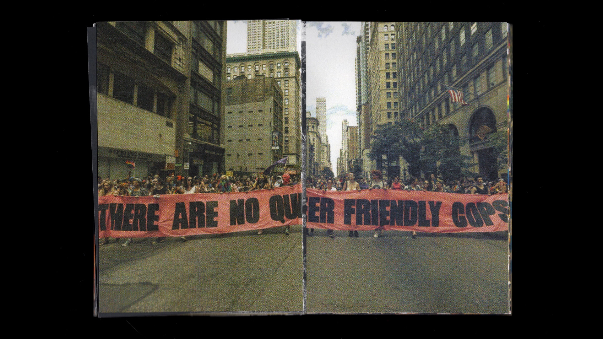
But it hasn’t been won. Sure, upper-middle-class white, gay, cisgendered American men may be thriving, but their Black and brown skintoned, non-gender-conforming, disabled counterparts have won little. The Human Rights Campaign has declared the fatal violence against majority Black trans women of color a national epidemic. Most of these murders are committed by police.
And yet, at Pride we celebrate, police in tow. Moreso, corporations celebrate. Eager to show their unconditional support for queer people, rainbow-filled logos and products grace every corner of contemporary Pride parades. “Glamazon” and Chase Bank throw little pennants, bead necklaces, and branded glasses our way to shout "you go girl!"
How has Pride transformed over the last 50 years?
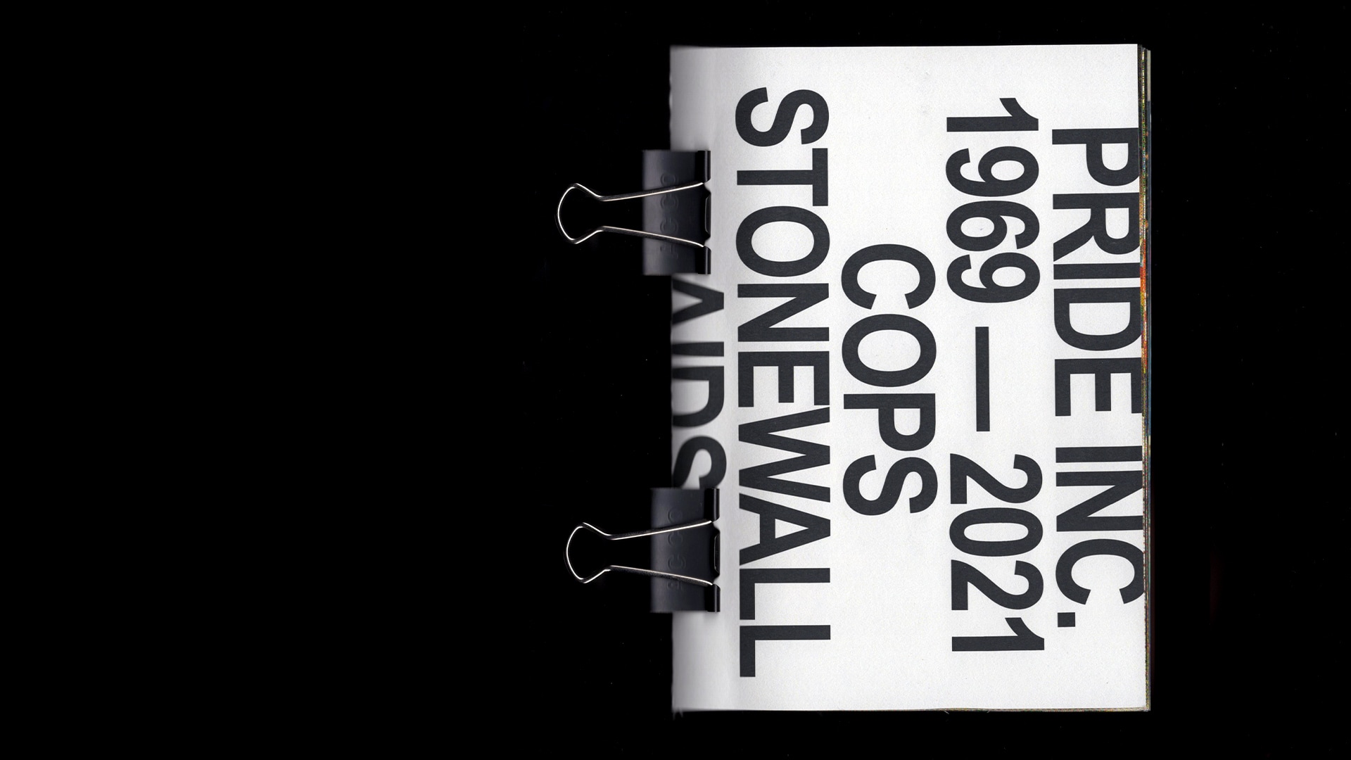
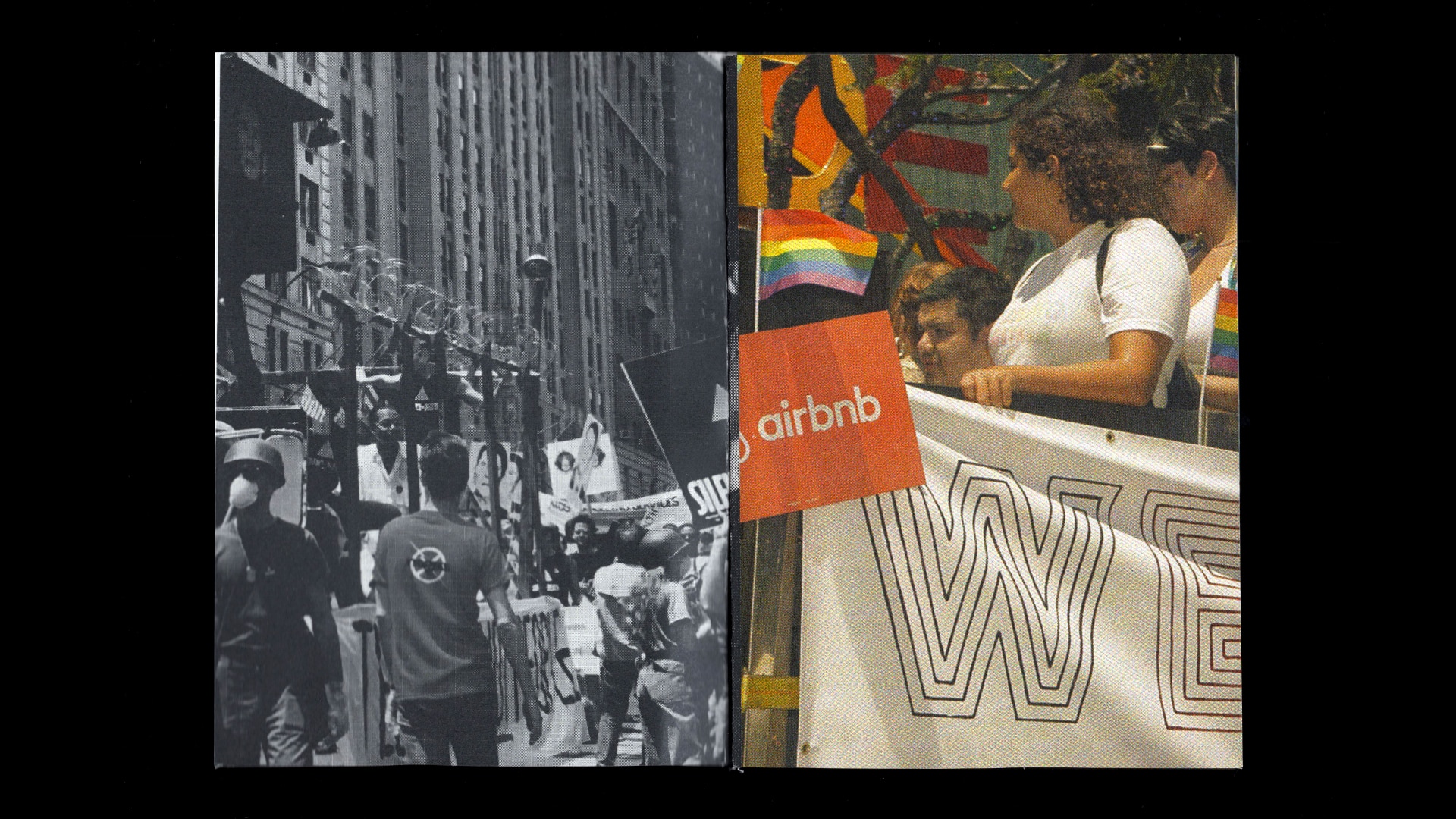
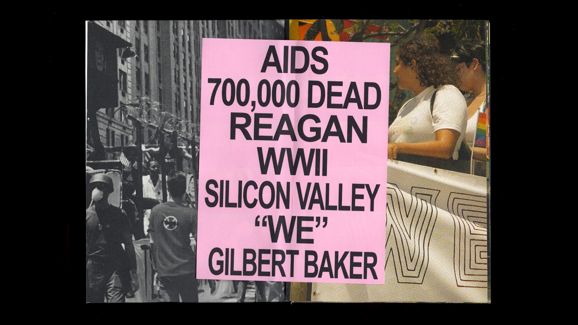
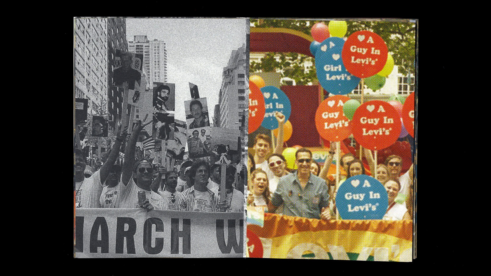
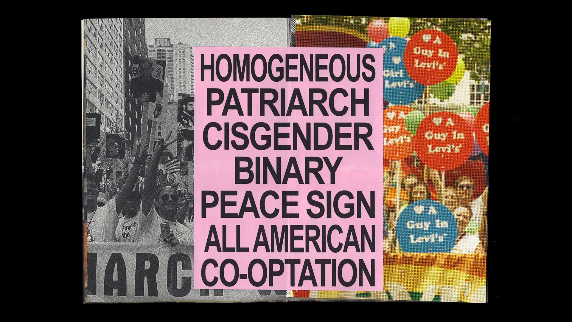
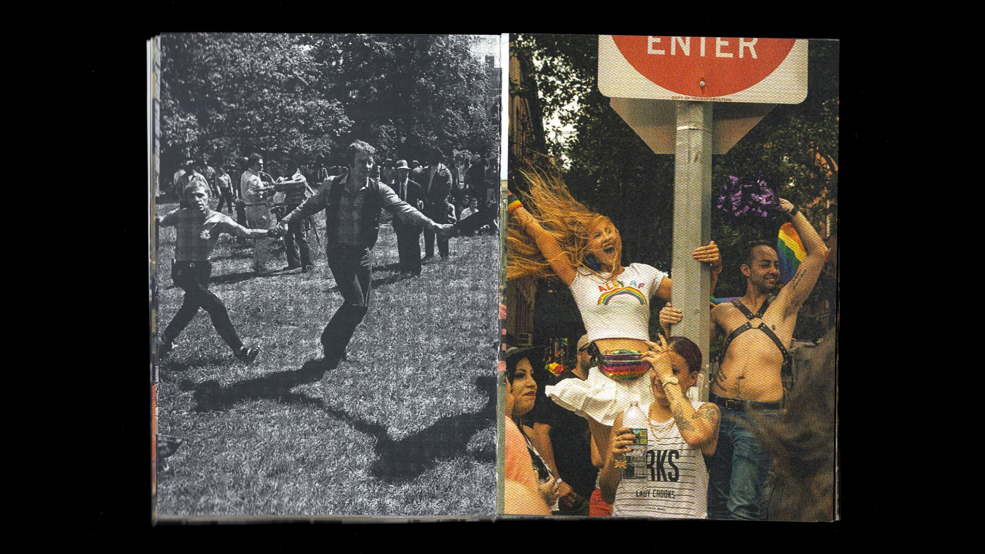
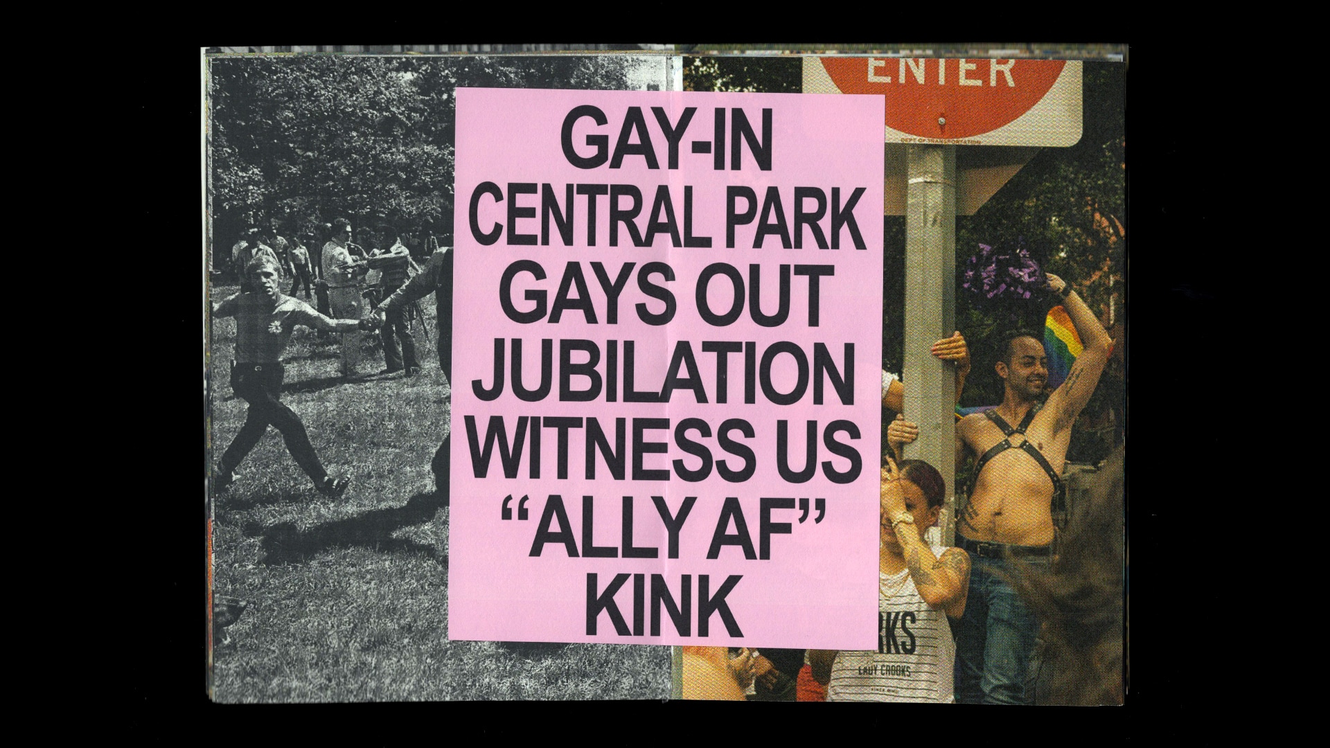
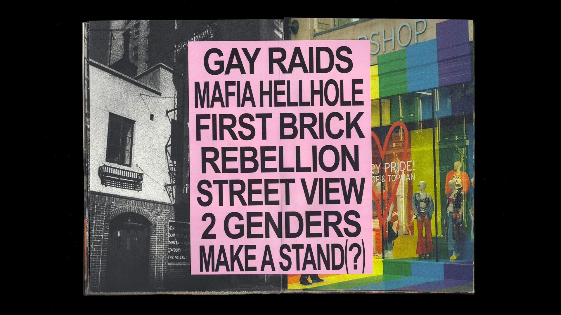
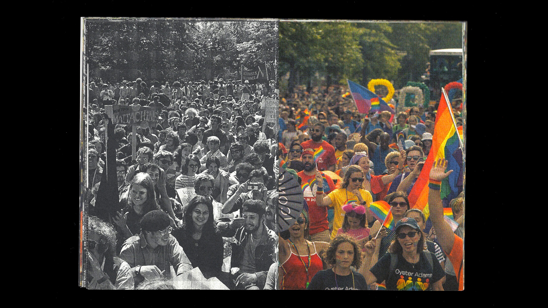
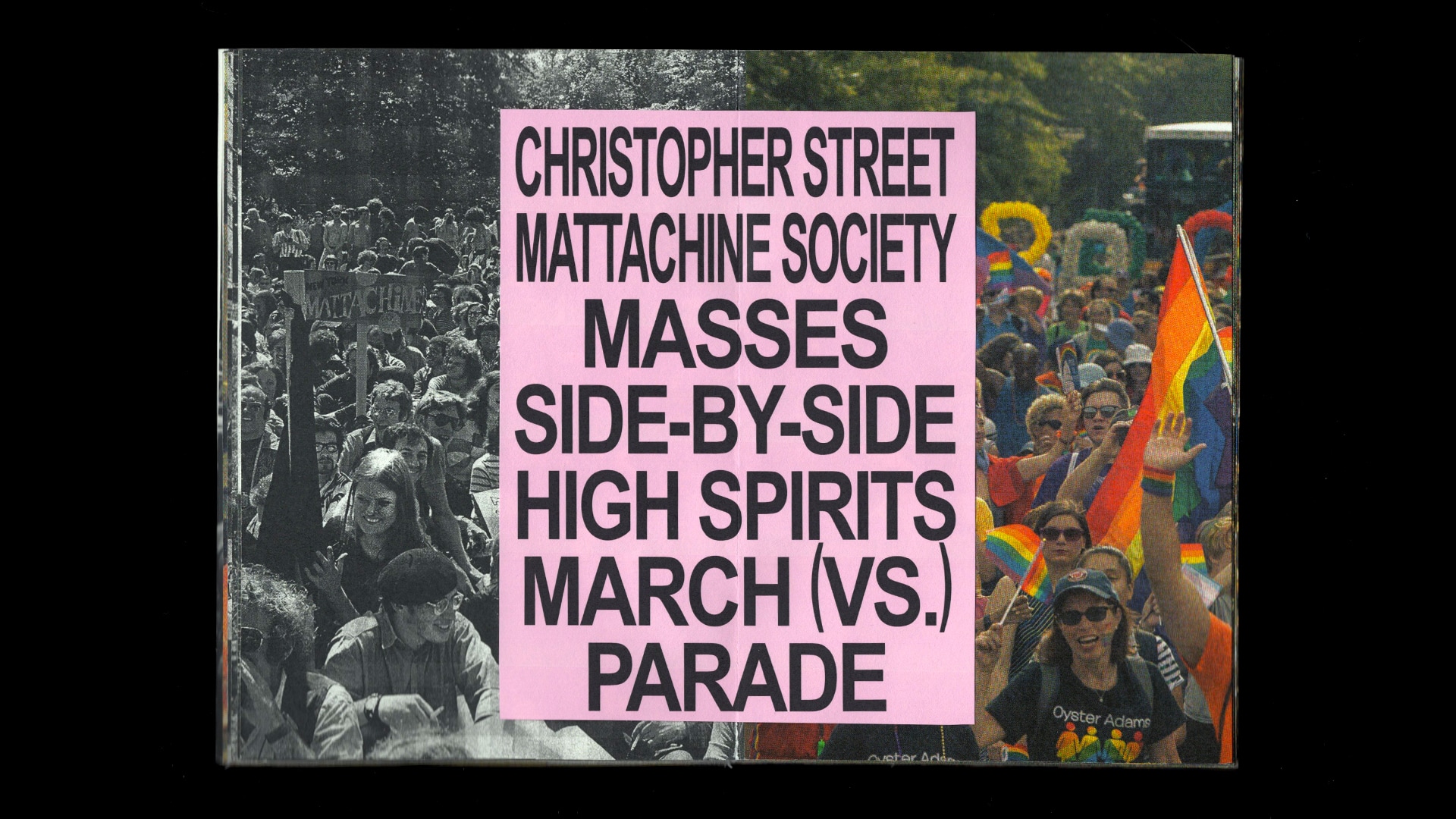
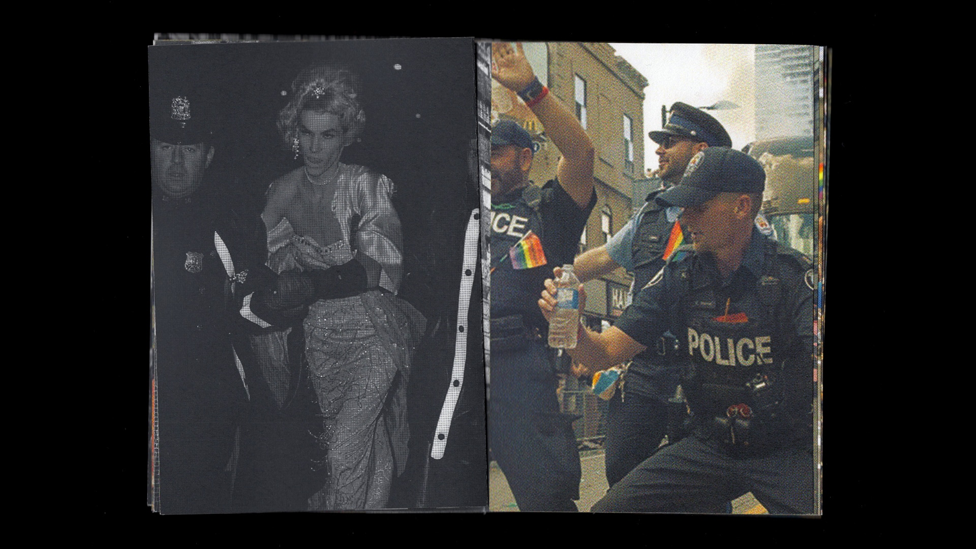
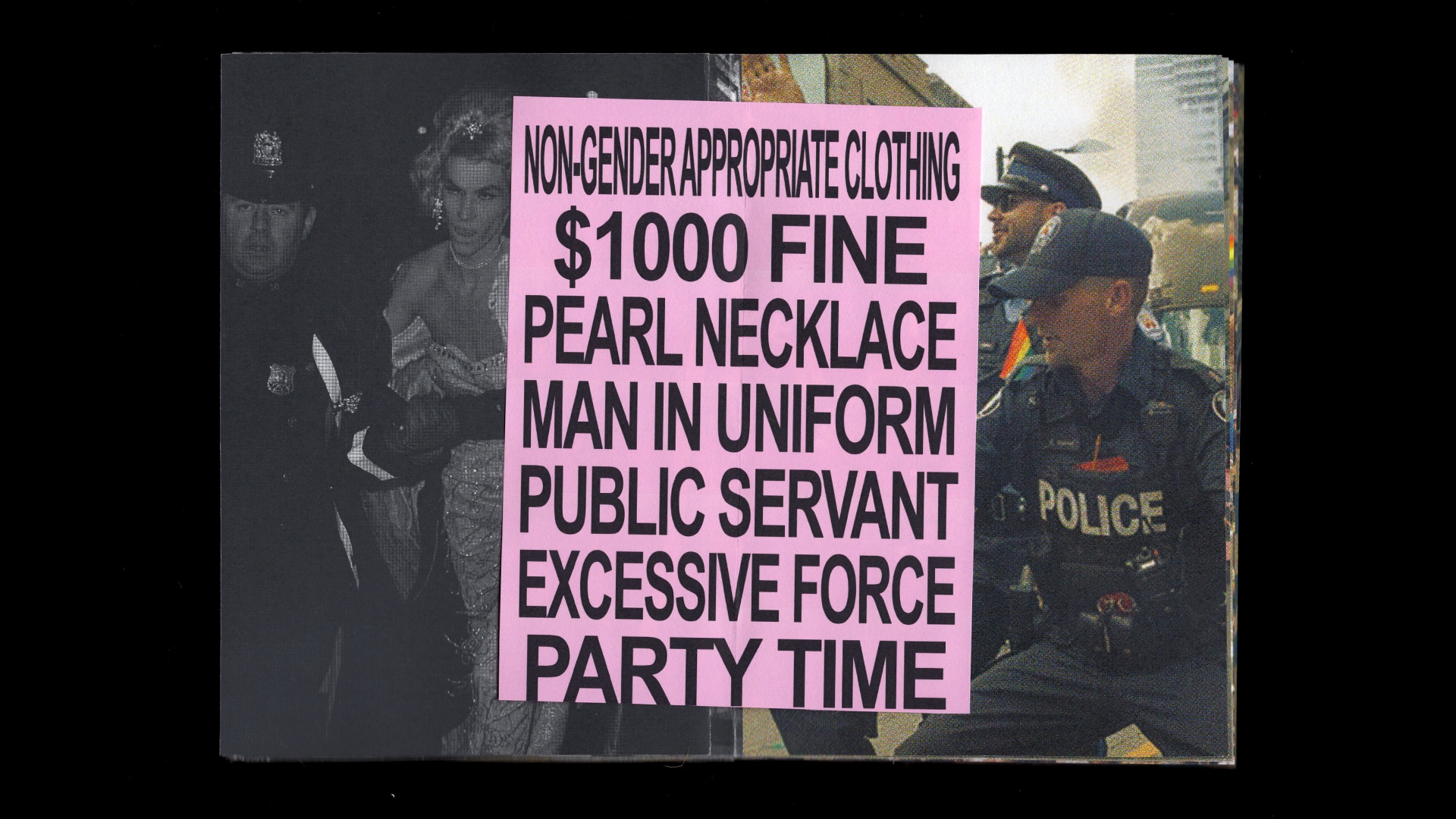
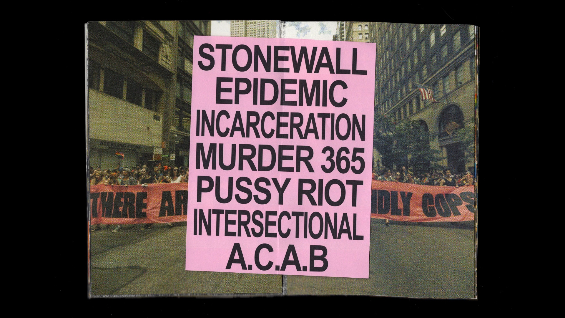
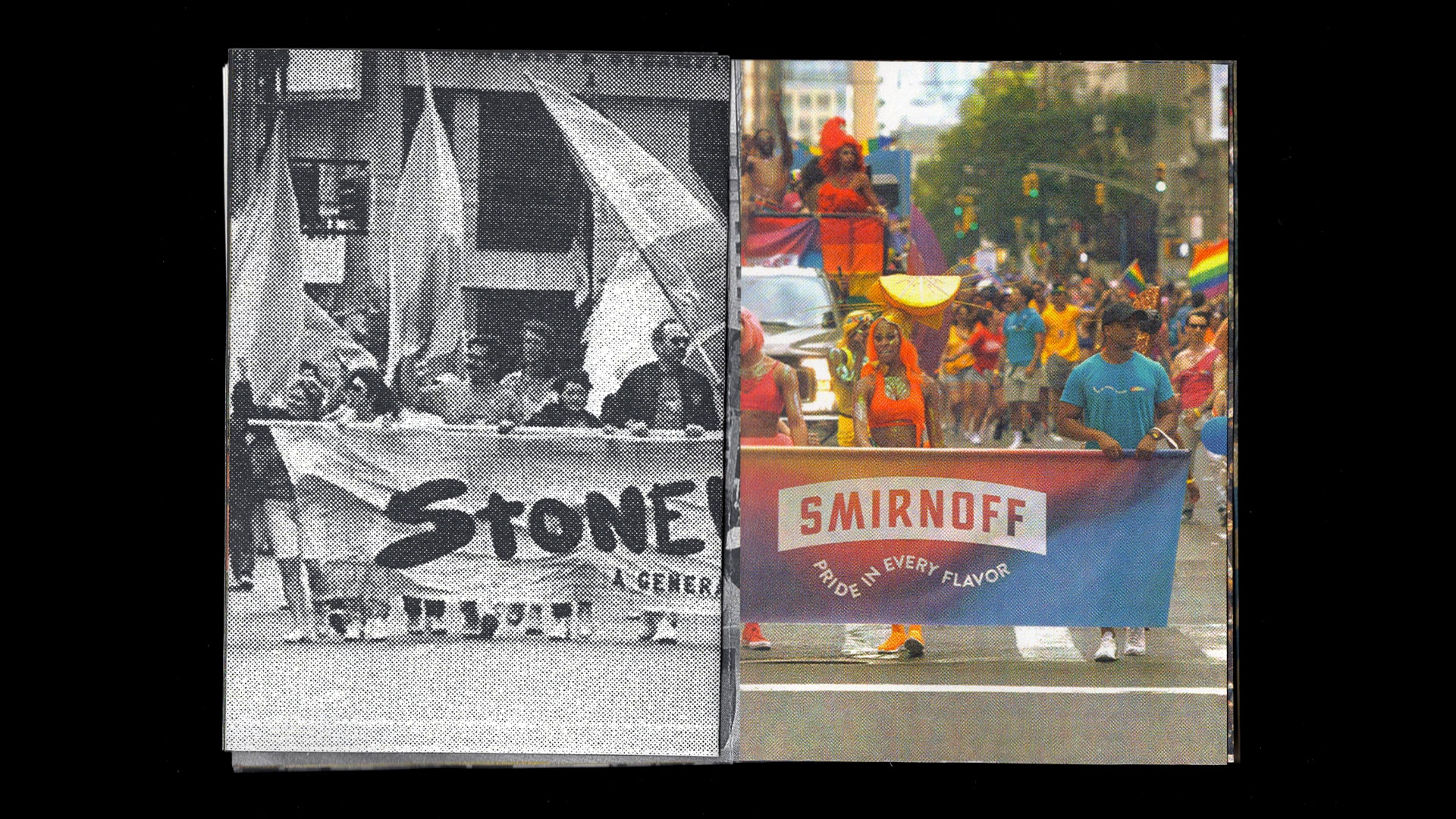
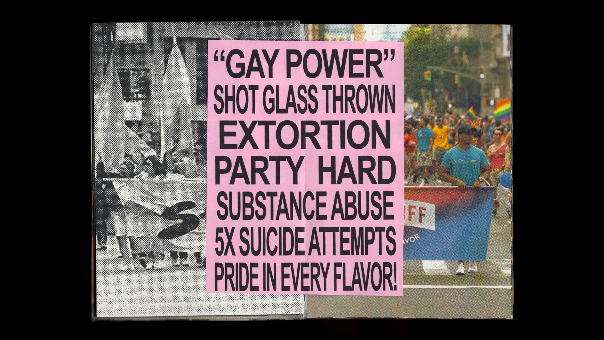
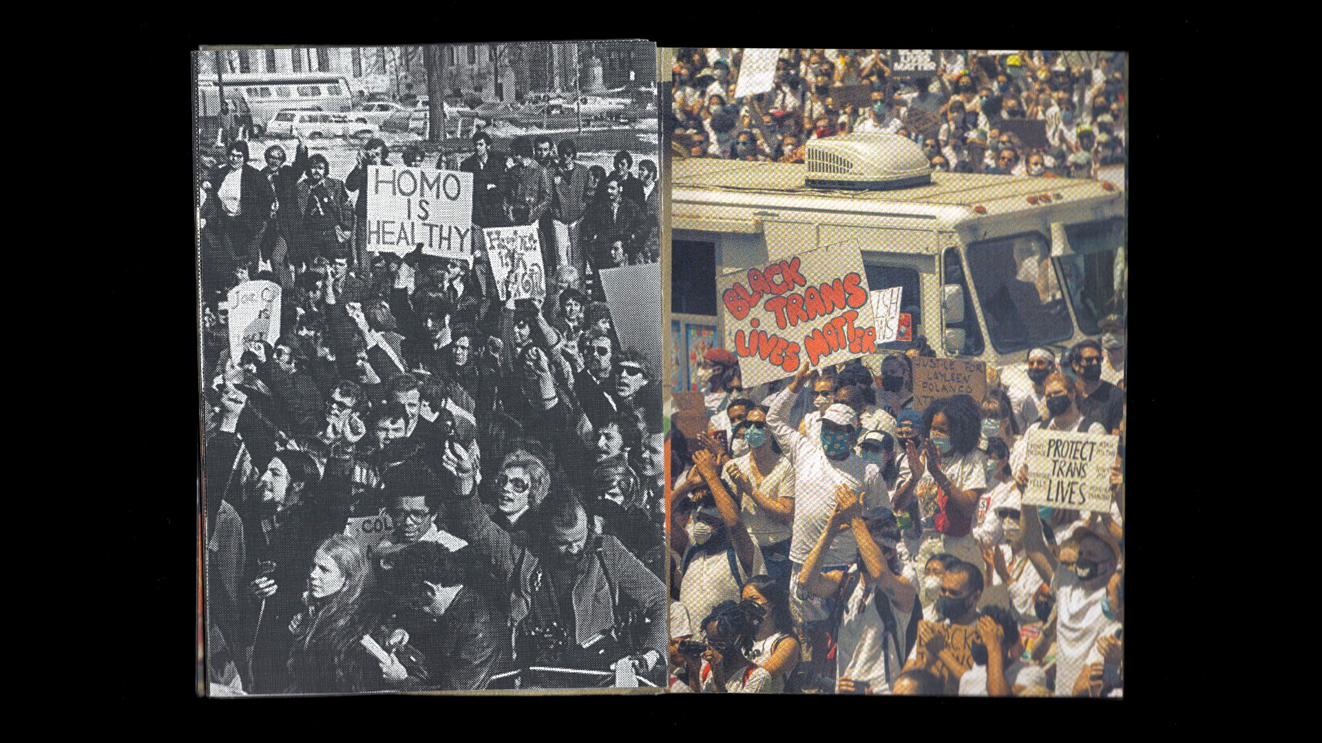
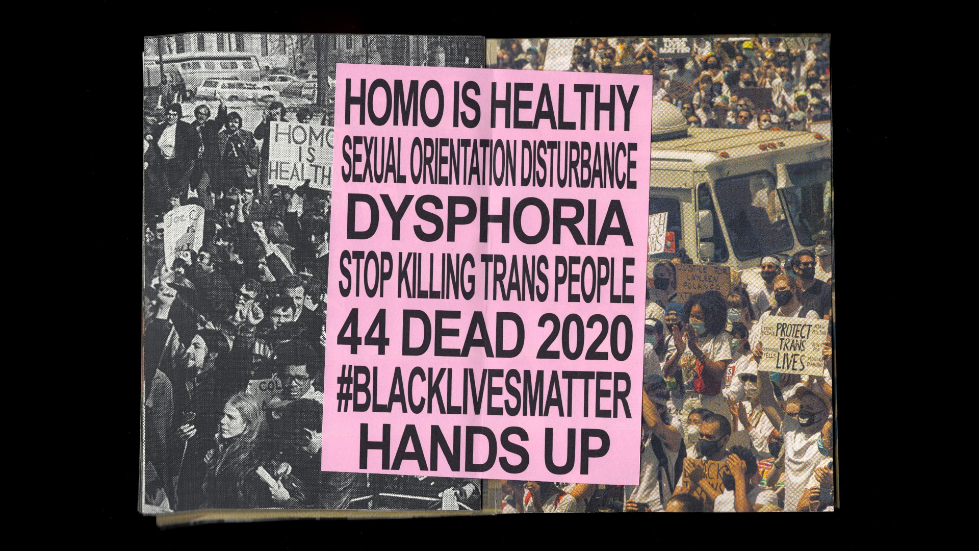
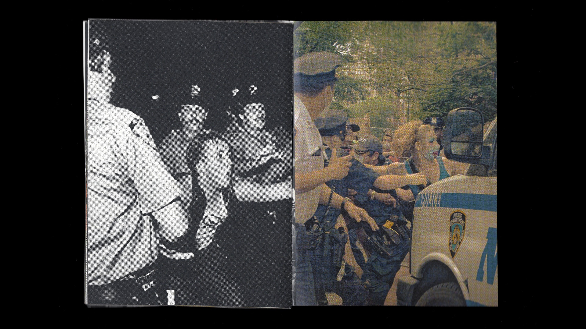
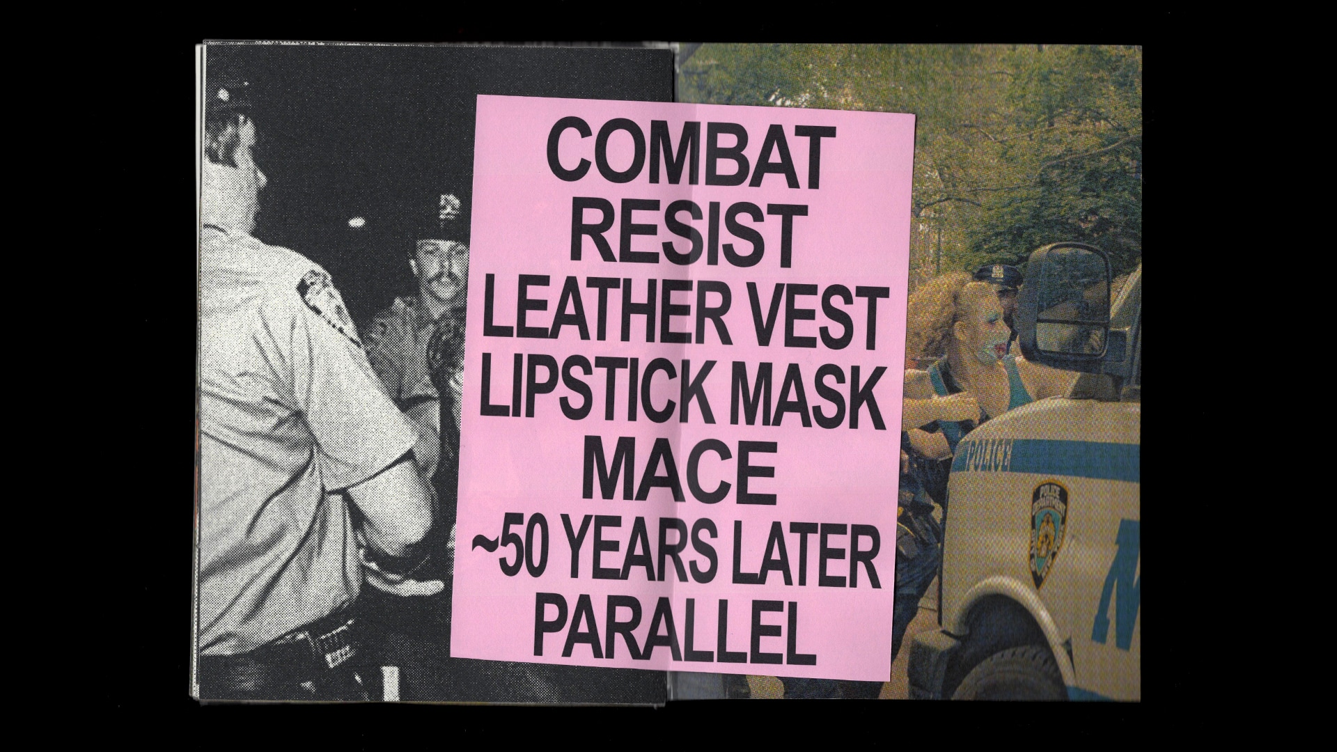
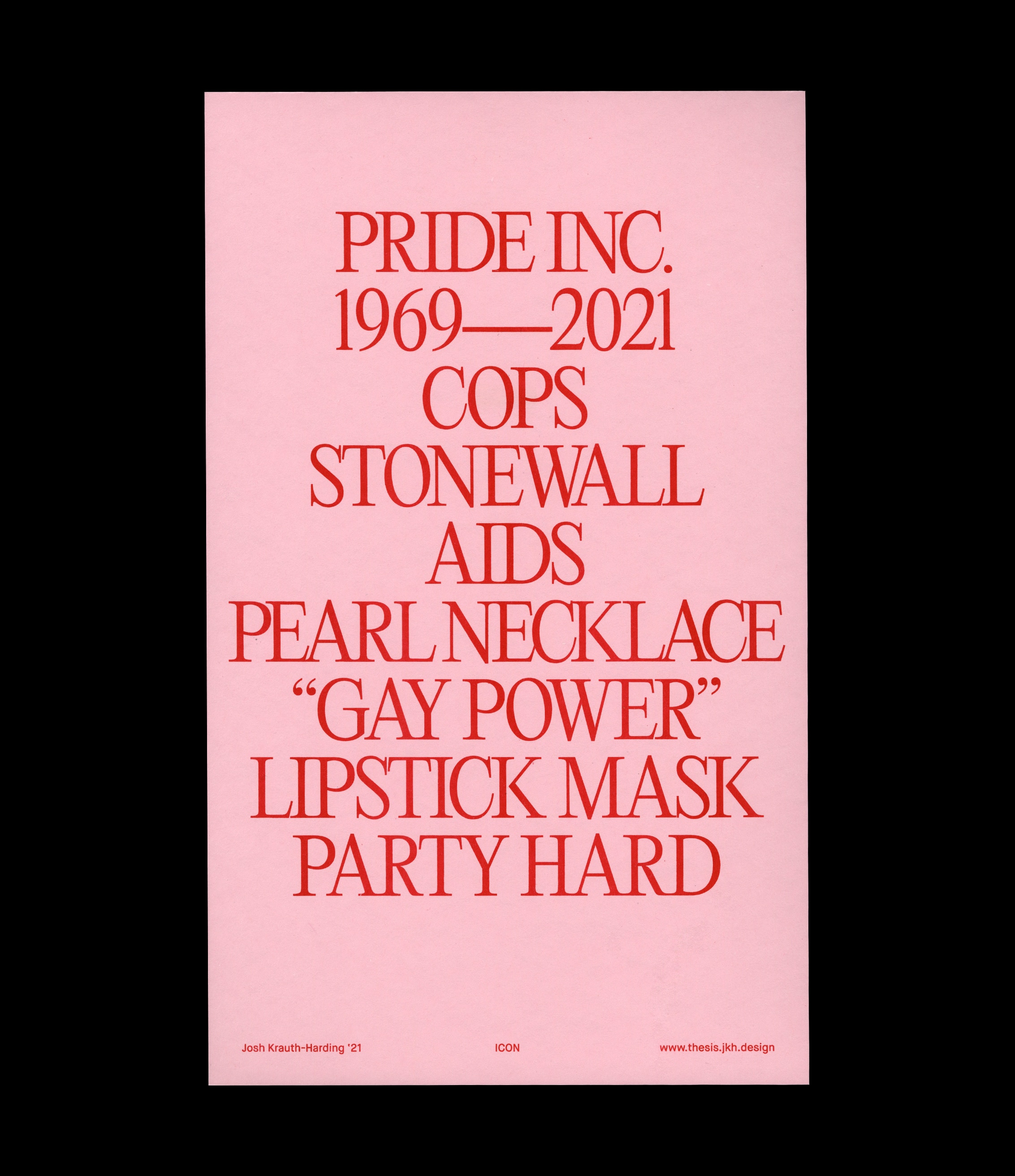
Frustrated with the disregard of queer liberation and the presence of cops and corporations at current-day Pride parades, my first visual exploration investigated the changes Pride marches and parades have undergone in the last 50 years (though mostly 49, as COVID-19 prevented a 50th parade). In this experiment, I juxtaposed photos from the Christopher Street Liberation March and photos from the last few years of parades, primarily focusing on the central gutter of the book where the two images collided. Overlain on top, personal observations I drew from the two images and their intersection worked almost as a stream of consciousness.
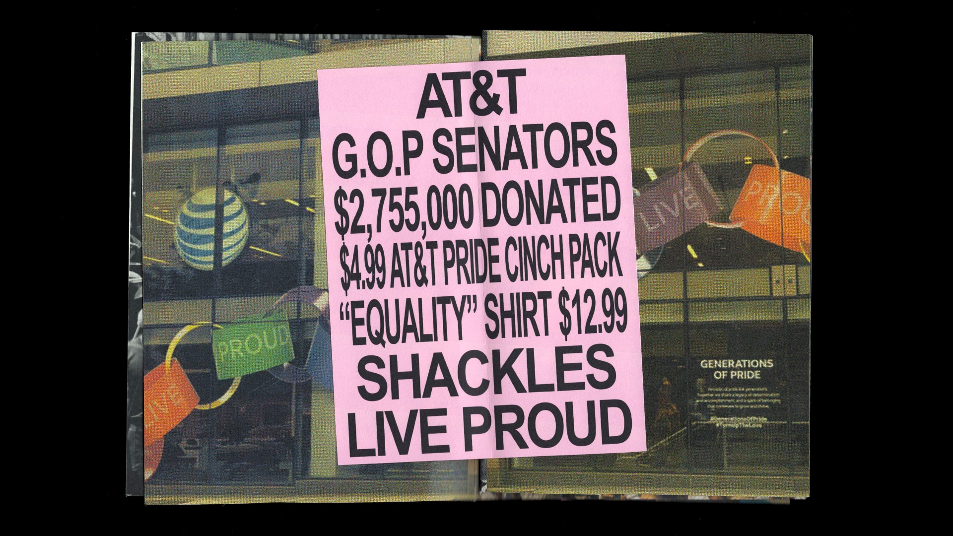
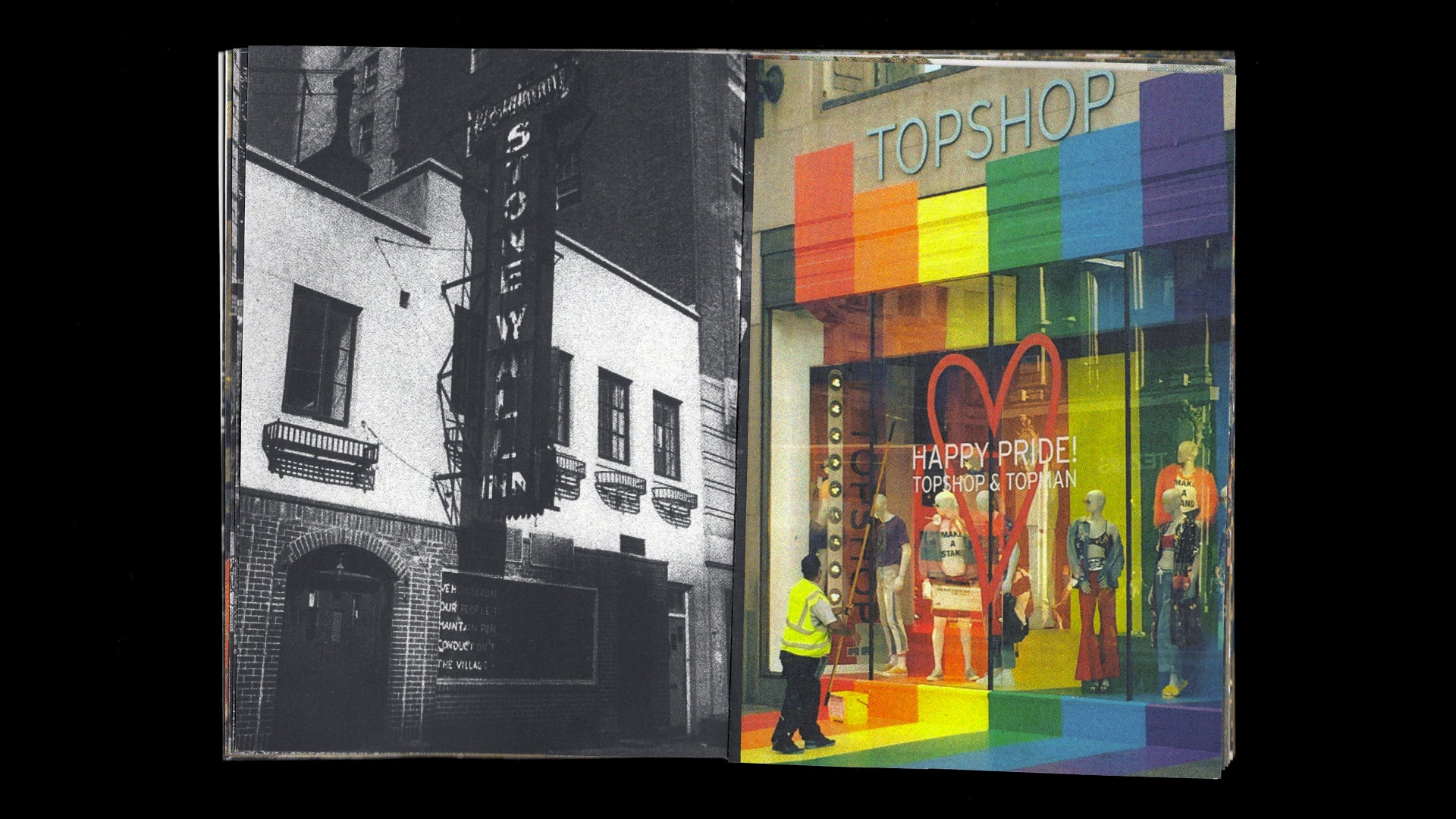
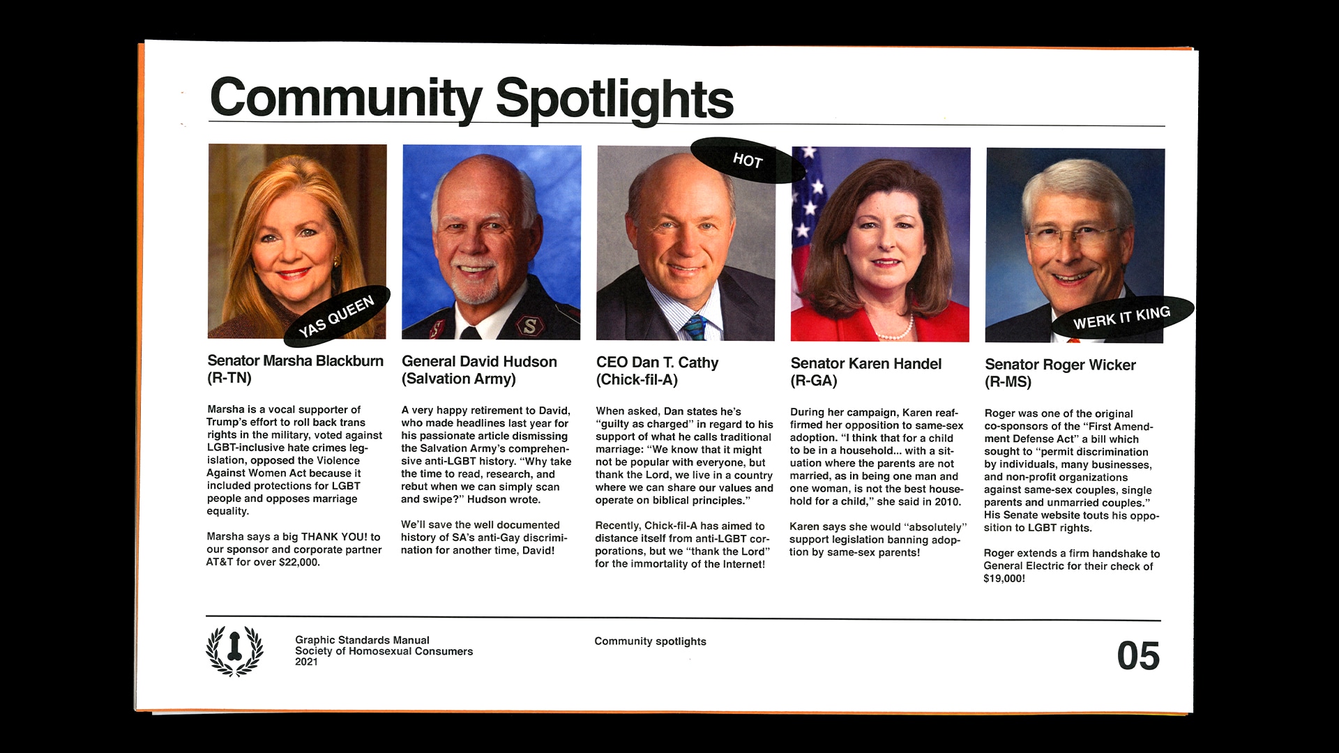
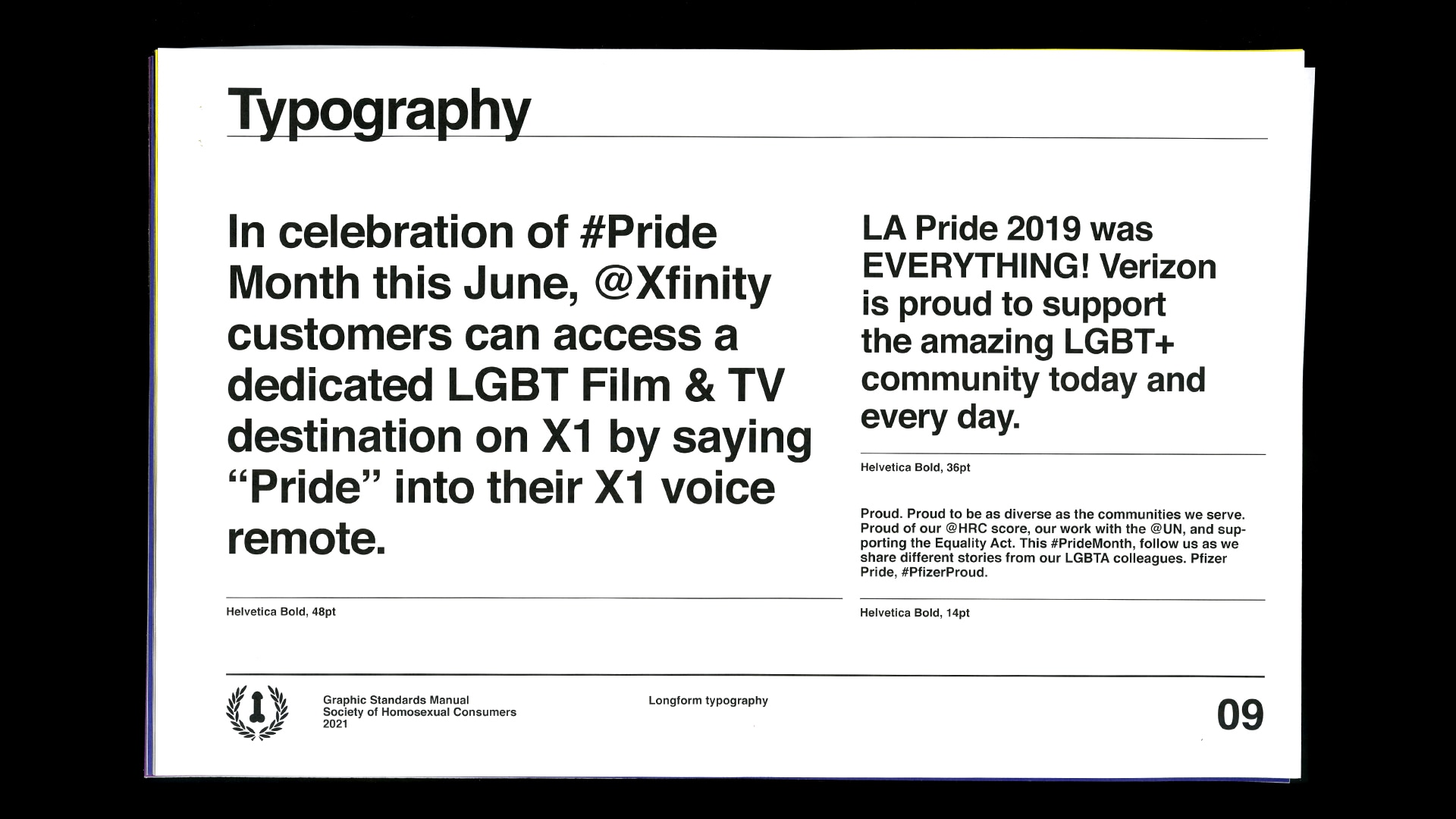
Specifically, I evaluated particular companies like AT&T, which though boasting unending support for their queer employees and offering products on their company store like the $4.99 "AT&T Pride Cinch Pack", donated over 2.7 million dollars to 193 anti-gay politicians between 2017 and 2018. I juxtaposed police brutality with police floats, Stonewall Inn with rainbow-themed storefronts, and picket signs with branded banners. It was not a challenge to find instances of hypocrisy.
With all of this said, however, this exploration was particularly important to me for one reason I have yet to mention: it challenged my own binary understanding of the topic at hand. At the conception of the zine, I was determined to illustrate a vibrant difference between two different Prides, showcasing how undeniably shallow contemporary parades are in contrast to the original march of 1969. But what I found was far more nuanced, that transgendered individuals were asked to march at the back of the line in 1969 in fear that they would be too difficult for onlookers to digest. I found that current day parades, as branded and corporate as they are, are also infinitely more diverse than their predecessors.
The Pride zine fundamentally shifted how I thought about liberation, political action, and celebration, and informed my later explorations in imperative and invaluable ways.
Can sexuality be branded?
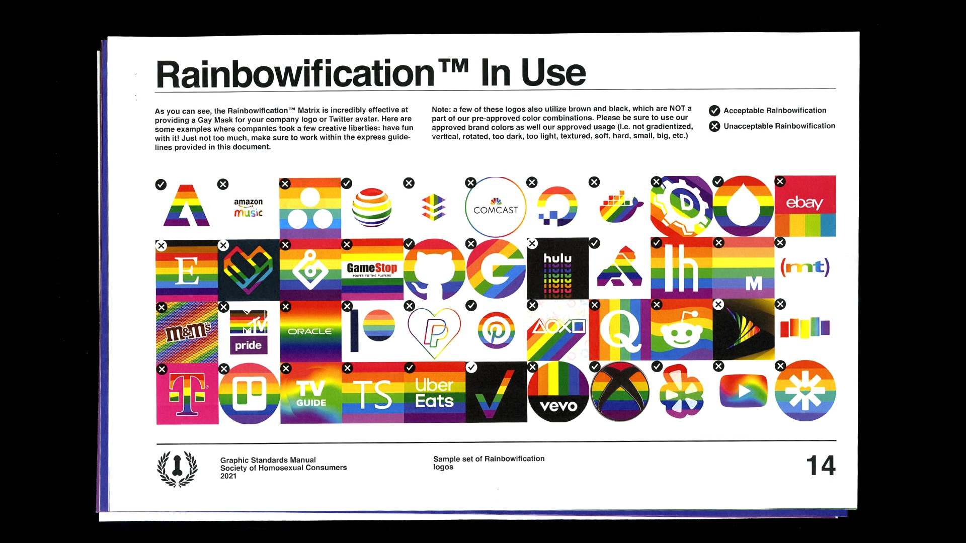
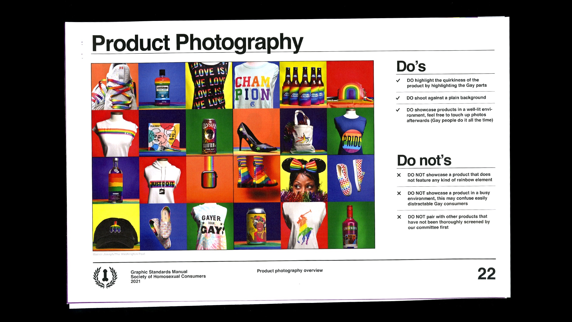
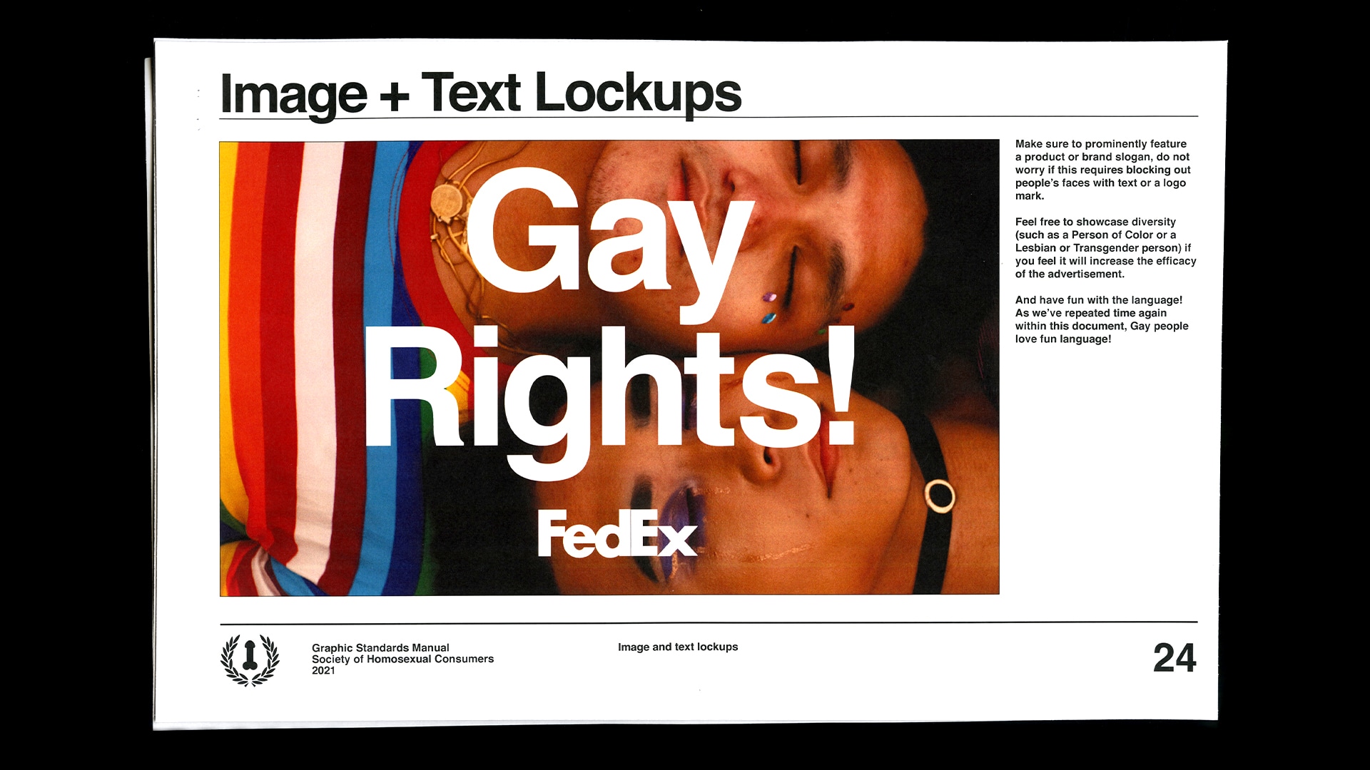
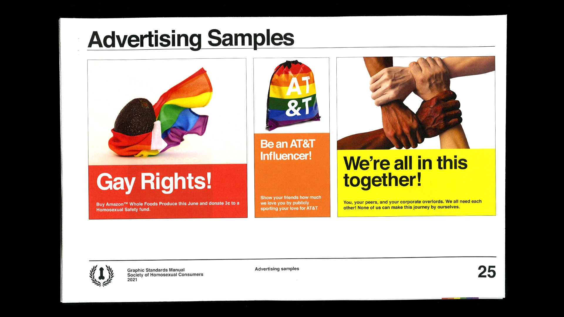
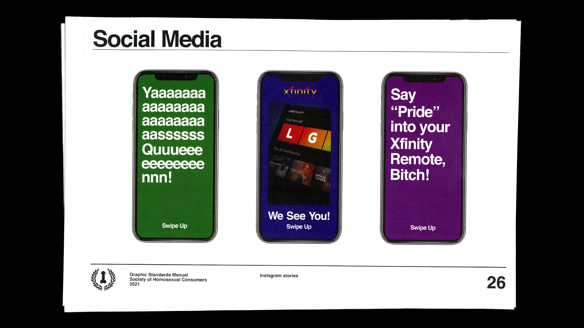
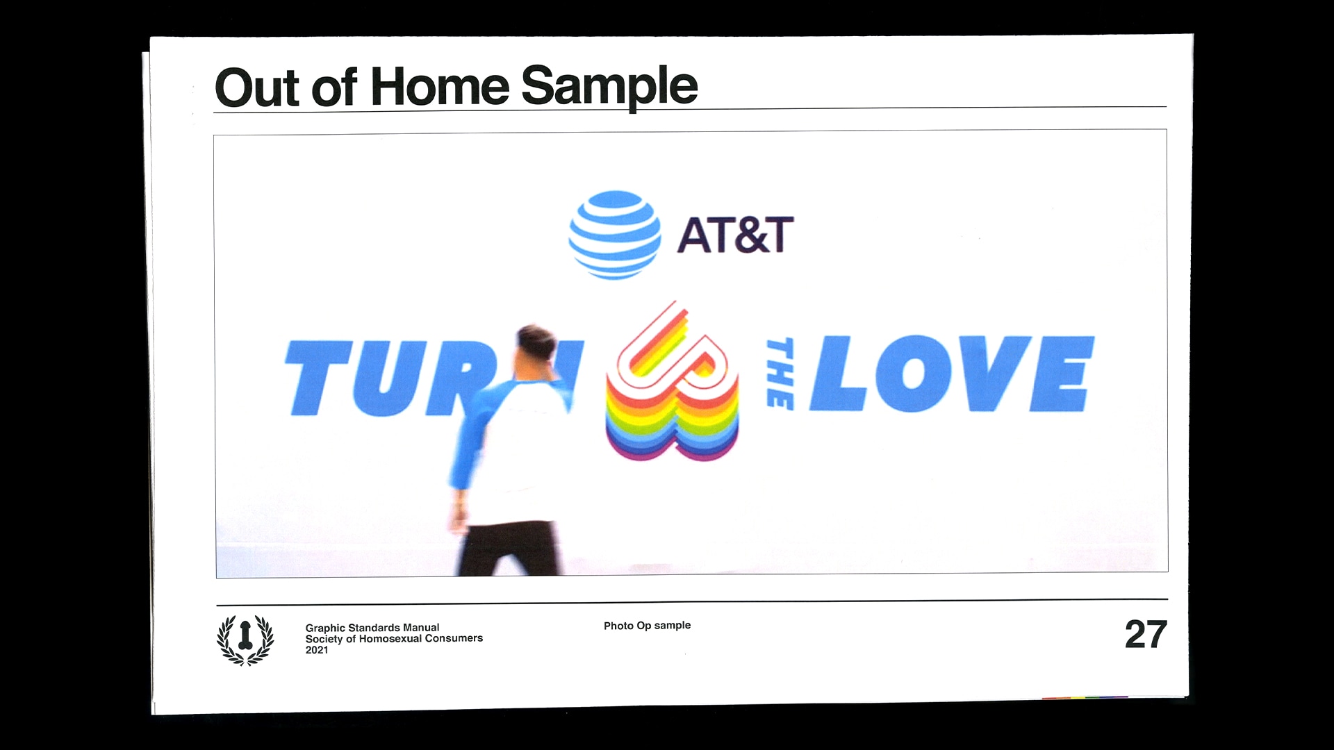
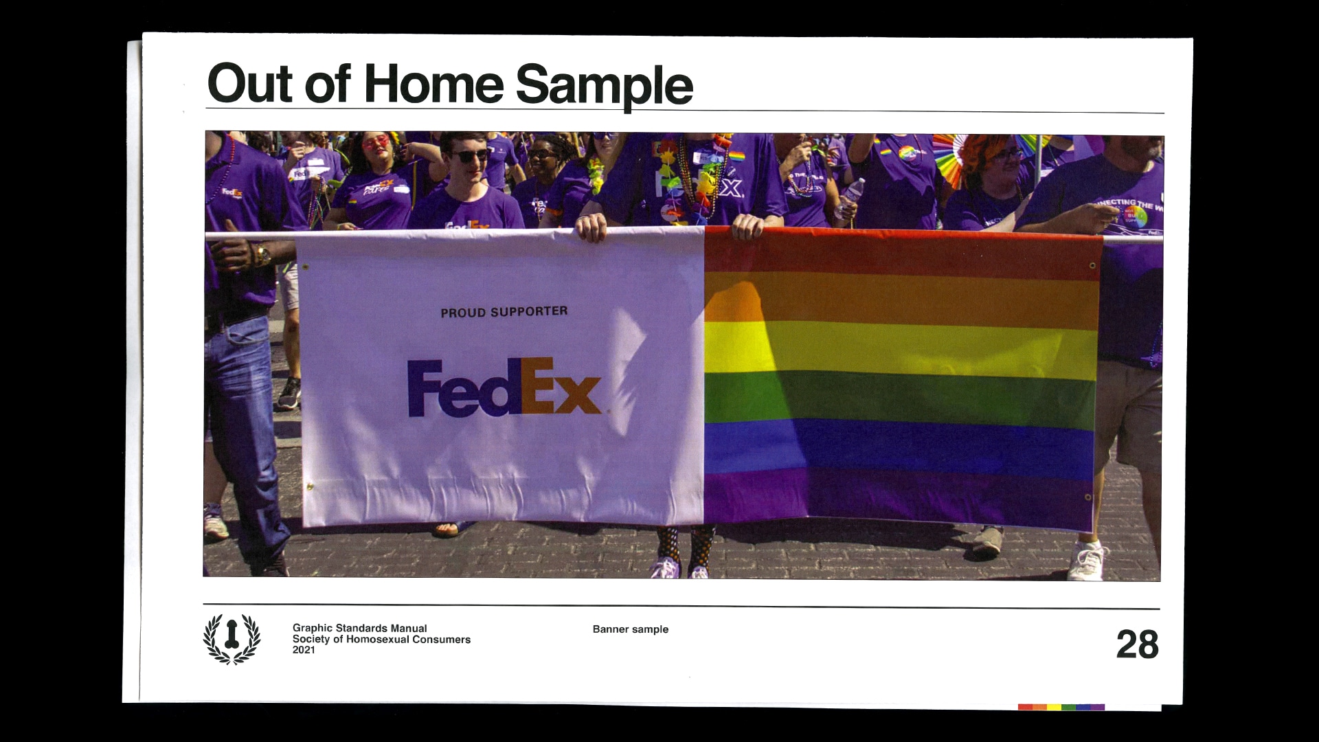
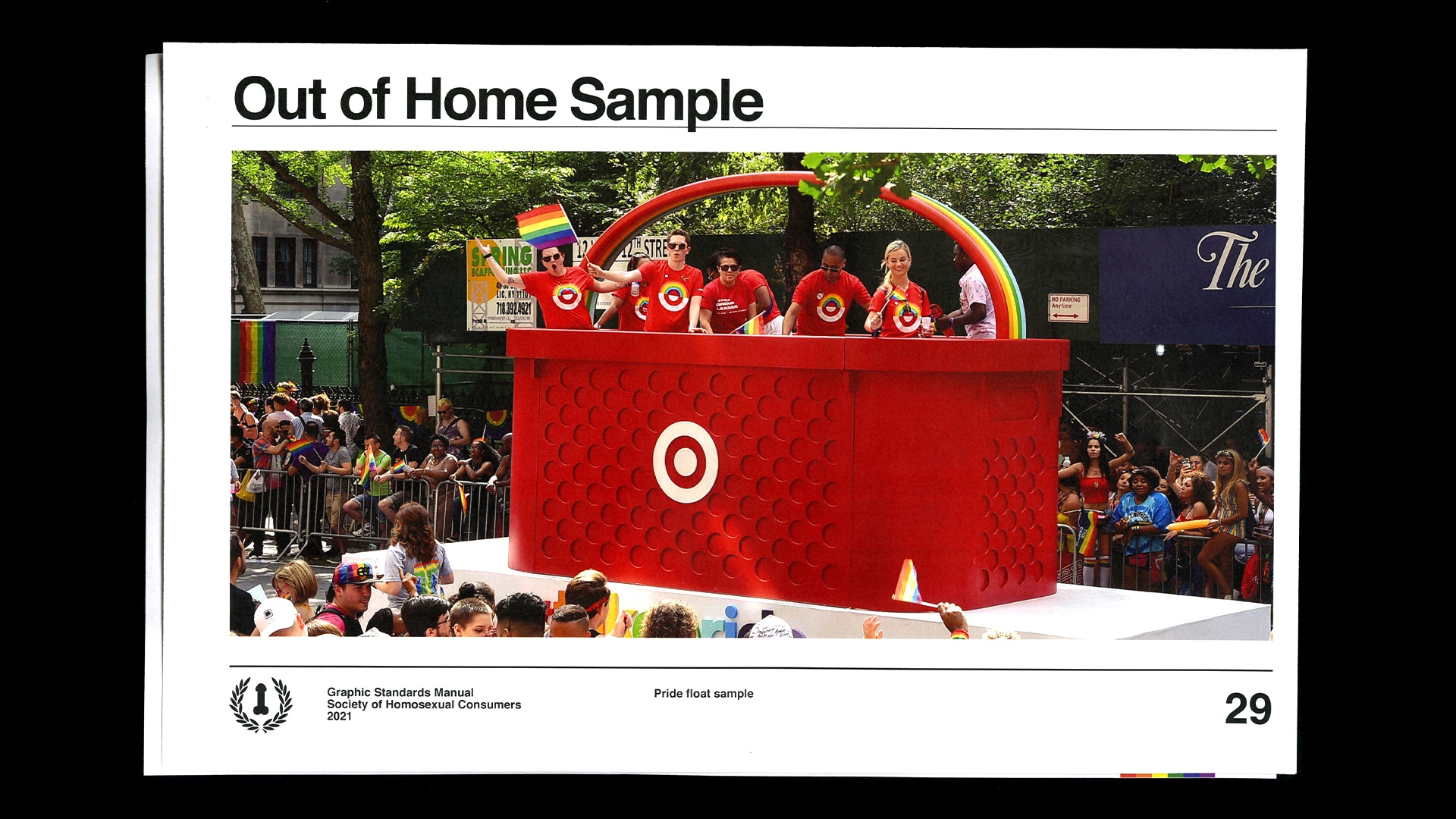
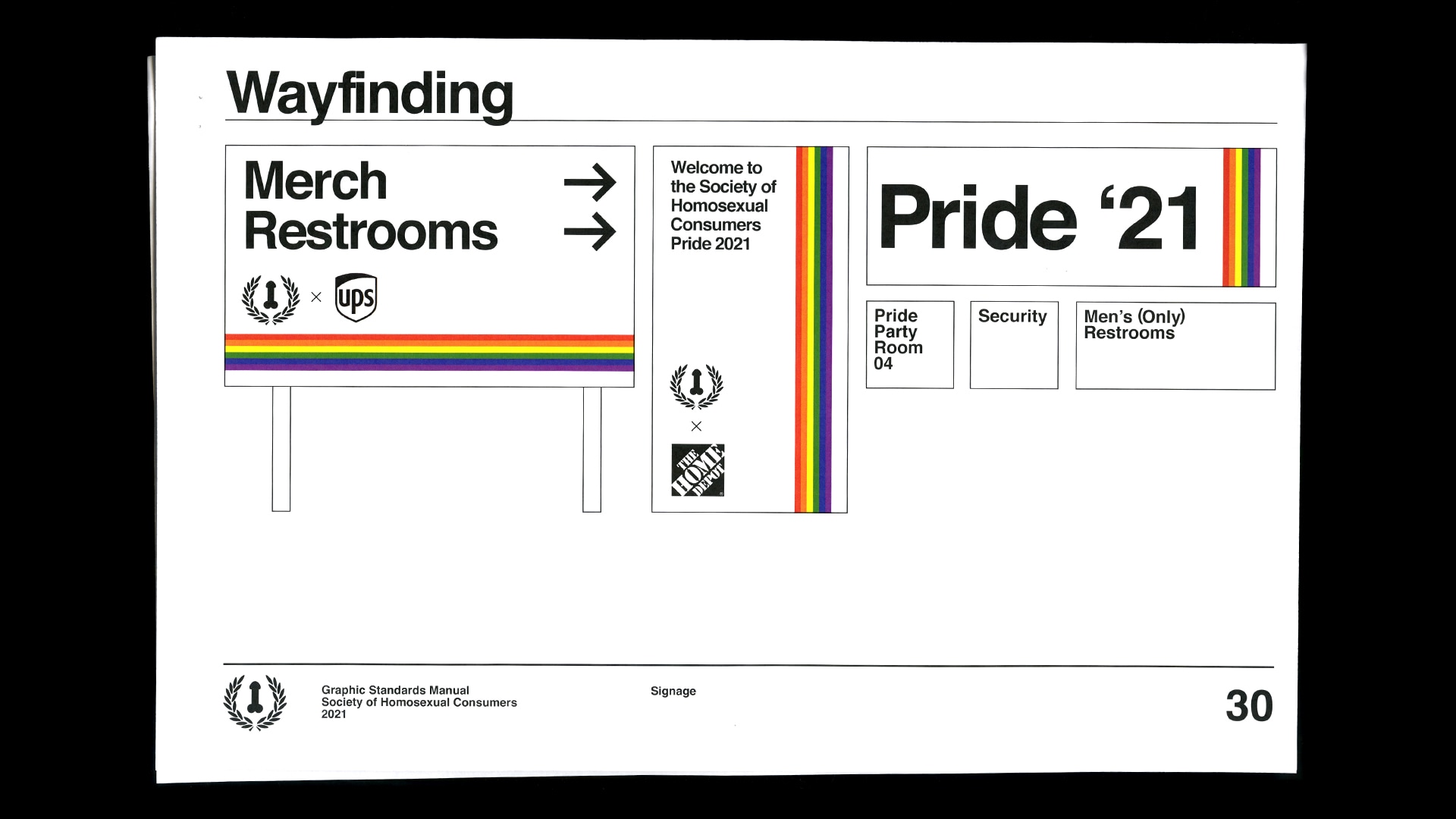
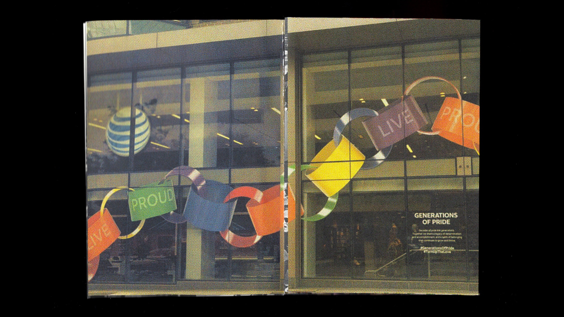
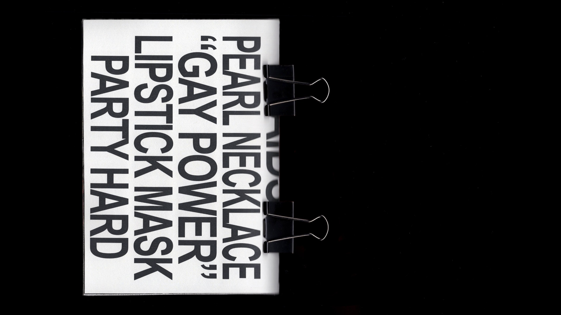
Corporate presence at Pride is more than a logo and a product, it's a rainbow logo and a product. My second visual exploration revolved around the idea of brand guidelines. They represent conformity and rigidness, and in many ways are the antithesis of a fluid system like sexuality. In this analysis, I spent most of my time taking a deeper look at how companies position themselves inside of social movements such as the queer liberation movement. I asked questions like: "what language do they use?" "how do they show gay people?" and "why does Target have a giant basket float?"
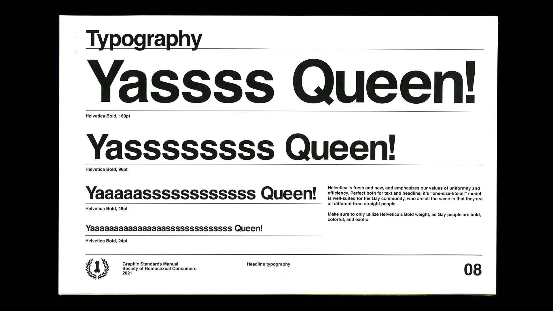
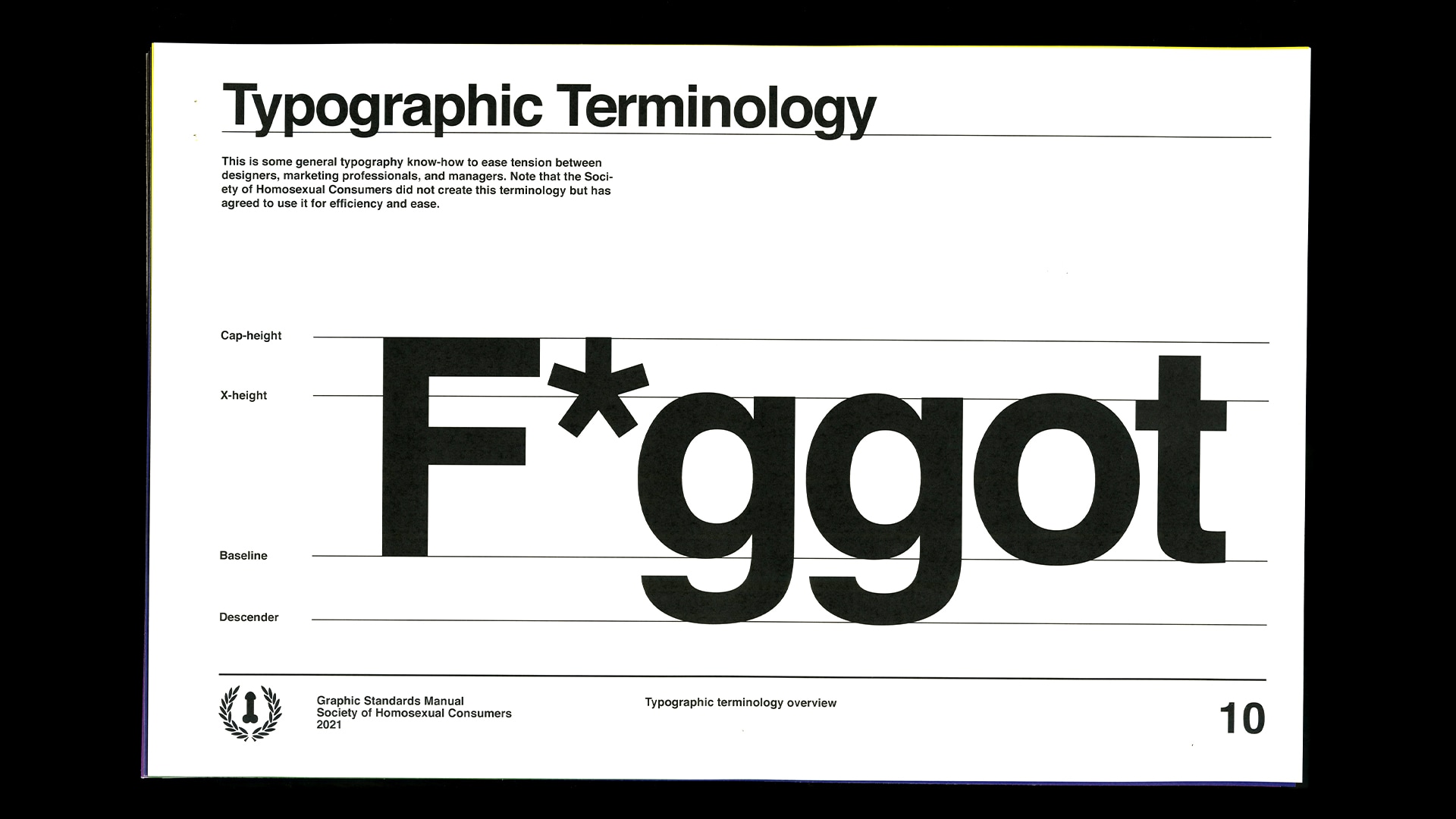
This exploration, in contrast to the previous one, enabled me to evaluate design and designers' involvement/complacency within the co-option of social change. A big part of the commentary of this piece directly referenced the harmful and tone-deaf decisions designers make when attempting to shift perception via design. In a lot of ways, I pushed this to extremes too, such as using Helvetica (a famously corporate typeface) and utilizing painfully played-out imagery like 2005 diversity images.
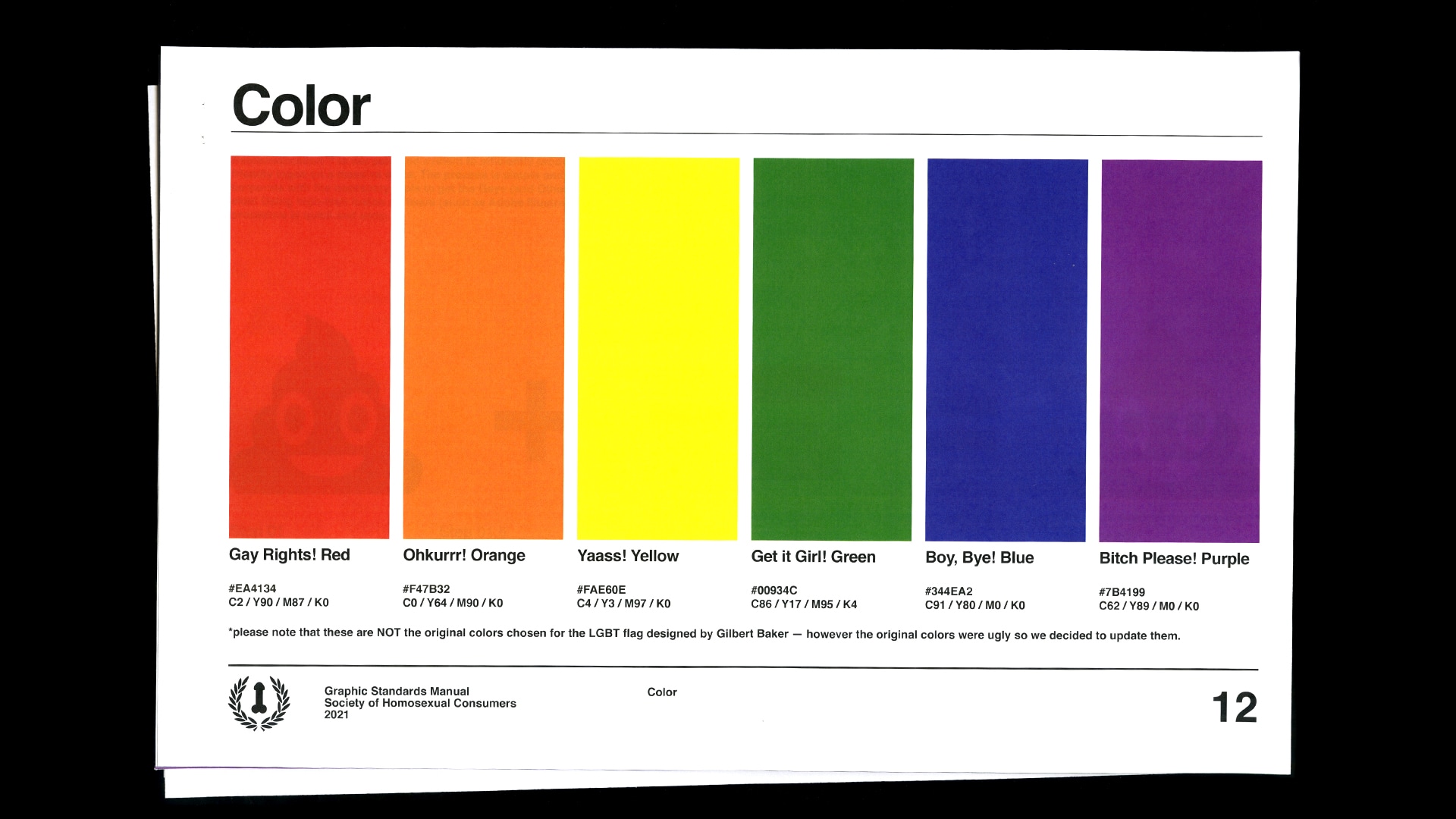
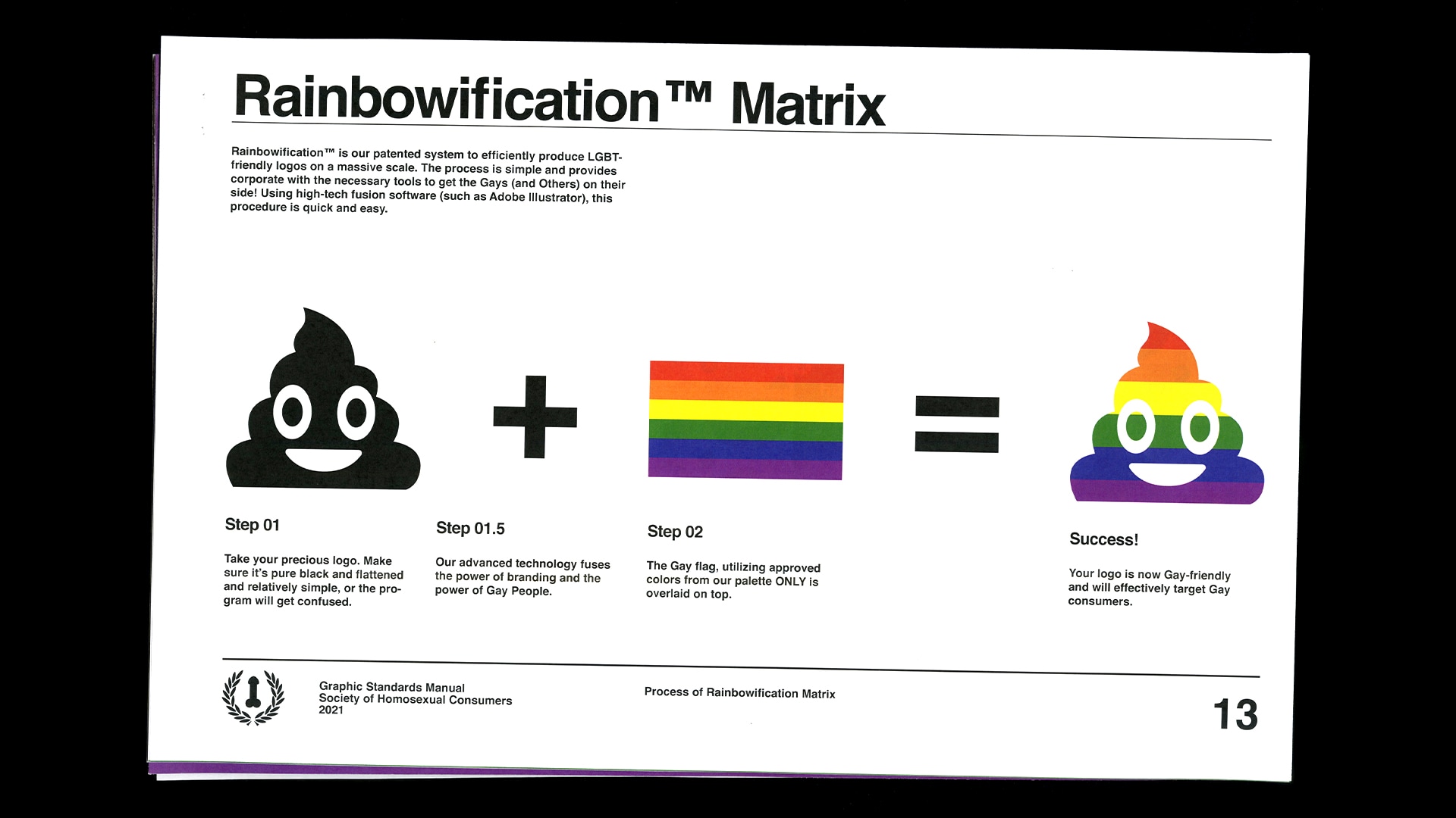
It also gave me the opportunity to investigate the "rainbowification" of queer branding. Specifically, I took a deeper look into the monolithic presence of Gilbert Baker’s Pride flag. Almost exclusively, queerness is represented by a wide range of vibrant hues to exemplify the vivacity and exoticism of queer culture—and although this is sometimes accurate—it also isn’t the complete truth. I found myself frustrated with how flattening and othering the Baker pride flag was, a major turning point and prompt for my next round of making.
What would it look like to depict my queerness visually?
Through two previous interrogations of Pride and design, my final exploration enabled me to apply my gathered insights and apply them genuinely. While both the zine and the brand guidelines were based in critique, ICON is an authentic and deeply personalized response.
Originally, I had planned on designing a system that I felt more accurately represented queerness—more than Baker’s rainbow did—but I found quickly that creating an alternative that was meant to be equally as all-encapsulating would be equally as flattening.
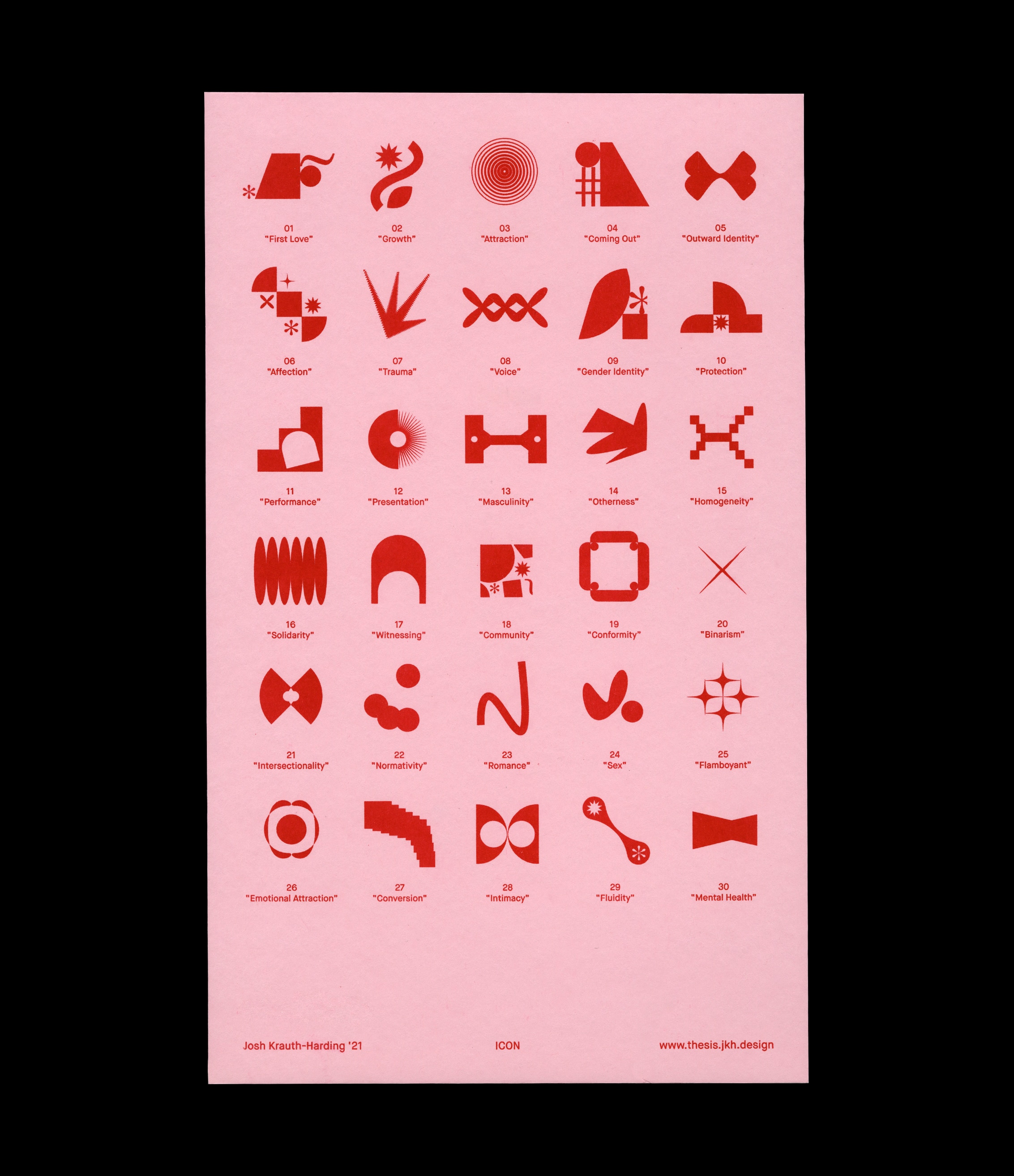
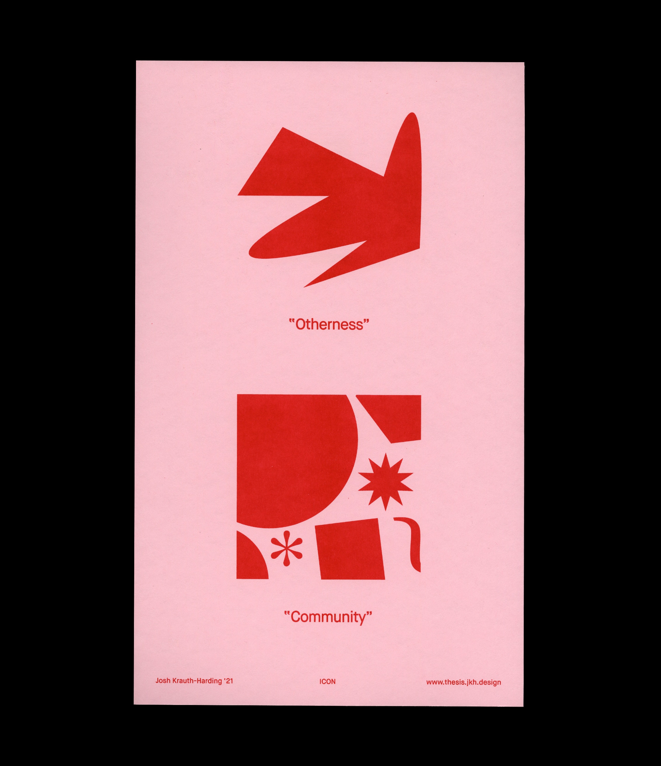
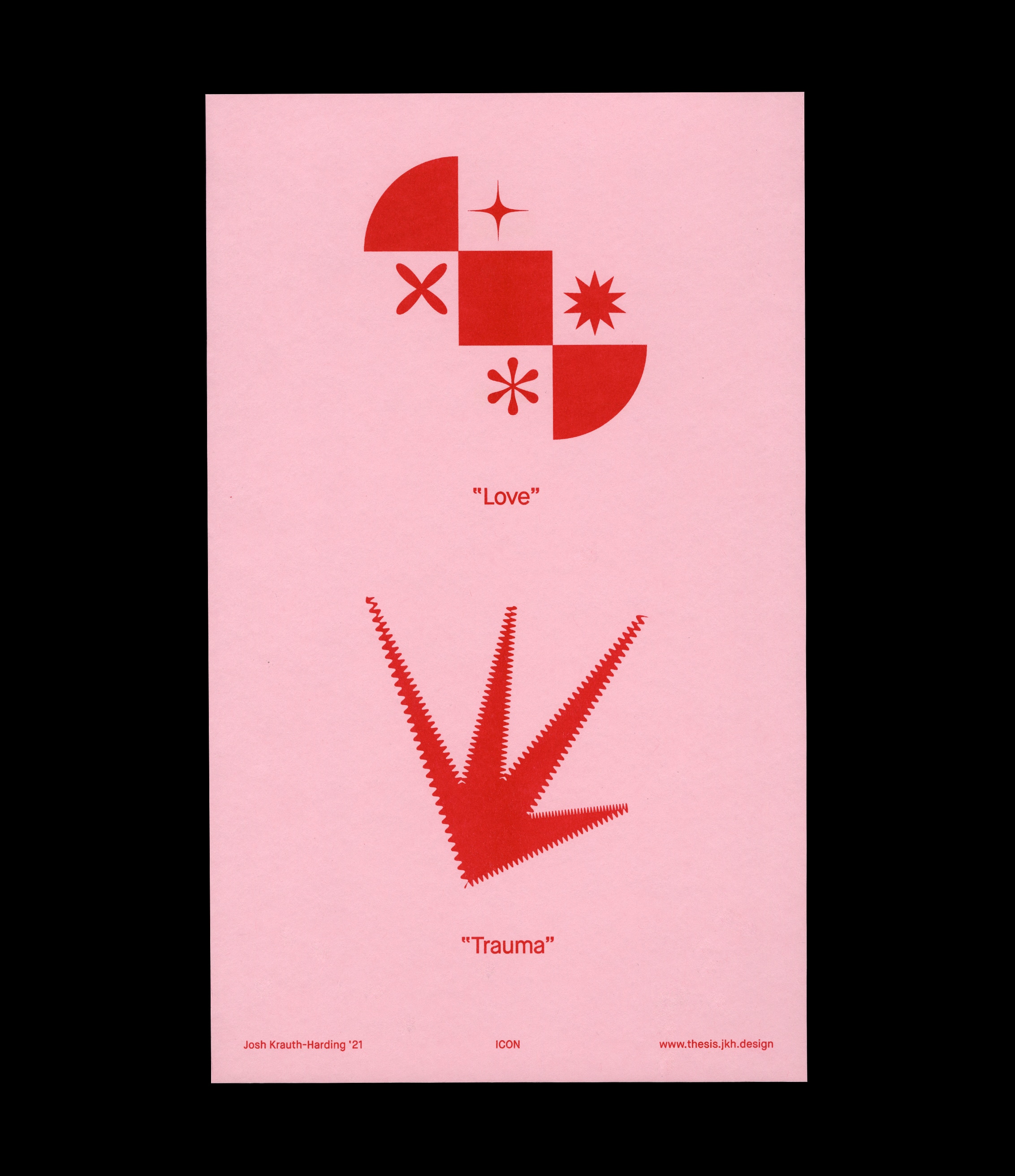
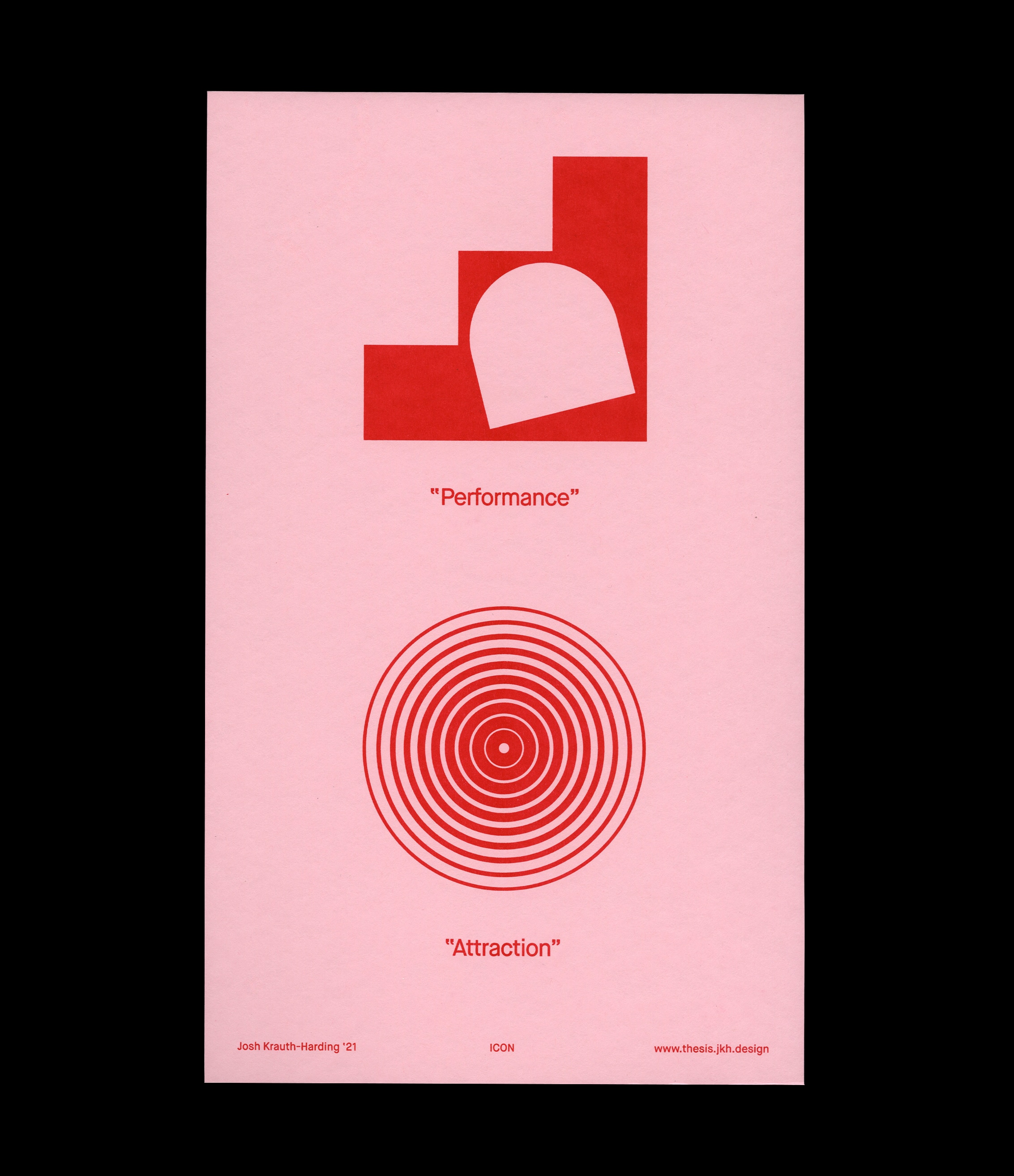
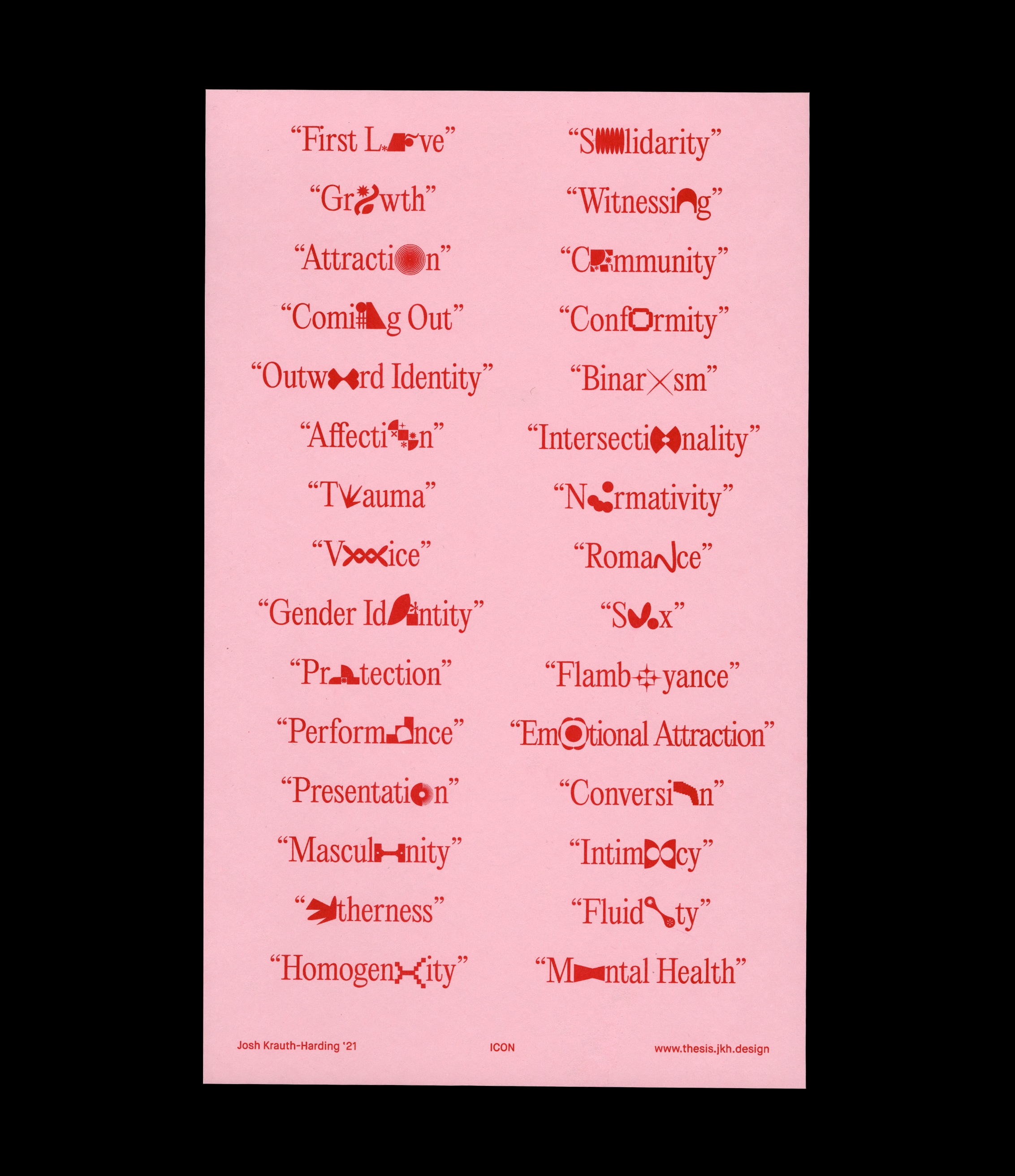
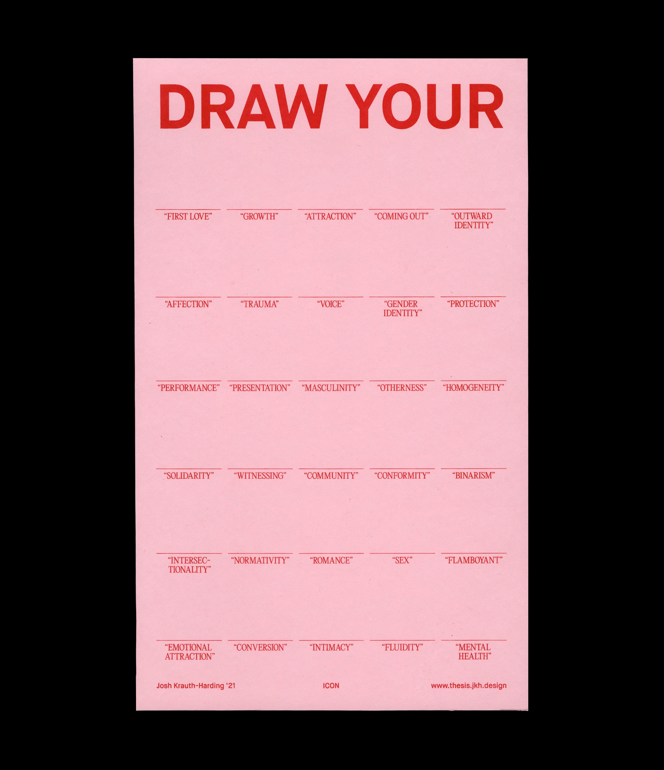
Instead, ICON is a library of iconographic compositions that visually depict my sexuality. Just my sexuality. Each portrait, consisting of one to five forms varying in complexity, responds to a different element of my personal queerness. Through prompts like growth, coming out, performance, and protection, I’ve developed forms and chosen colors that I feel cohesively and accurately capture the essence of my sexual experience.
Through motion, this final system utilizes movement, color, and form to paint a more honest acknowledgement of the multi-dimensionality of queerness and its individual application to each person who experiences it.
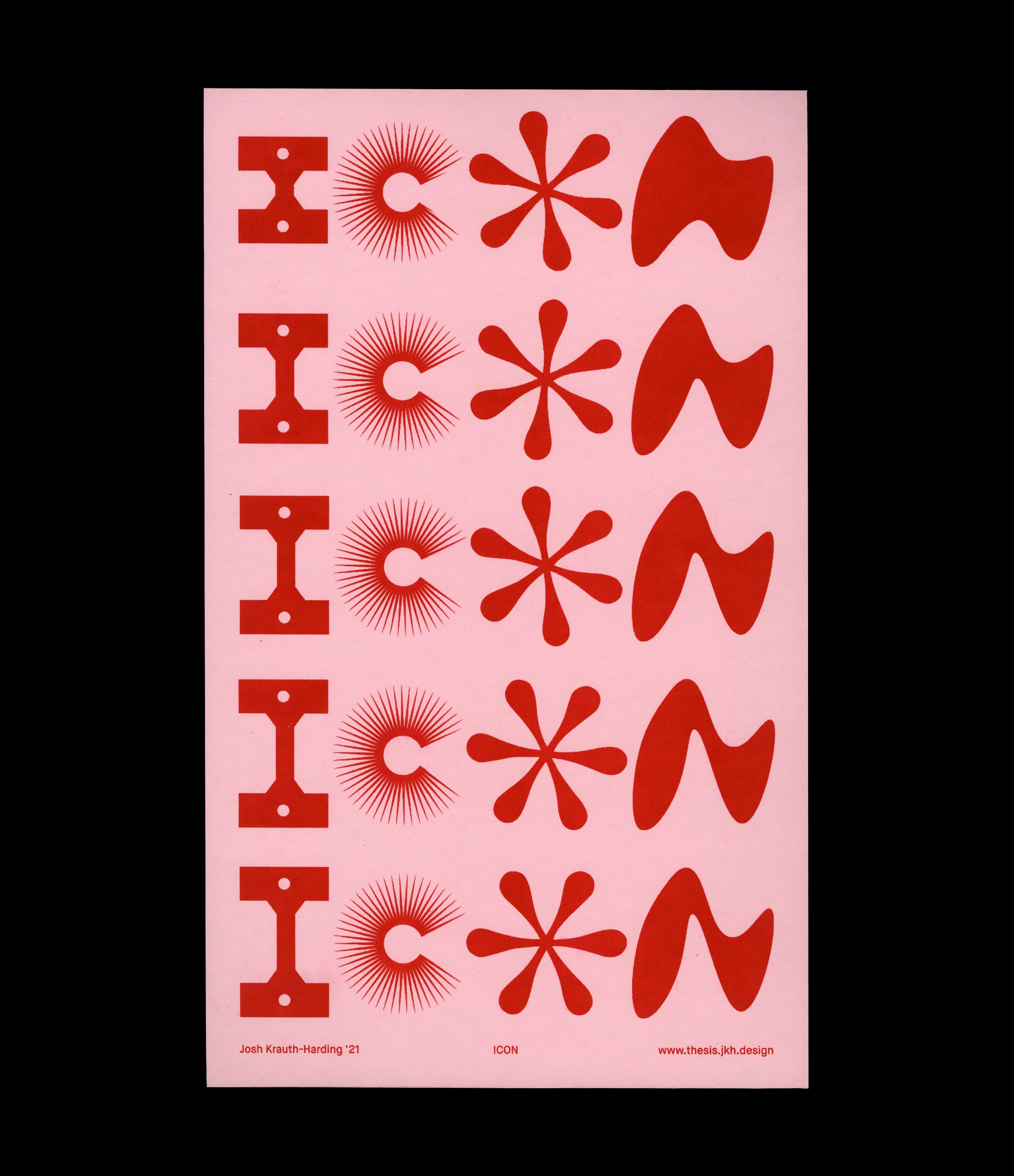
ICON is not a solution, but a personal journey. It’s content, authored by and individual to me, asks grander questions about the involvement of design and its relationship to people. It asks designers to challenge the notion of universality in design, and asks corporations to think twice before splashing their logo with a rainbow hue for Pride month.